
1. Introduction: Building an Interactive File Upload System
Uploading files is one of the most common actions in web applications. Yet it remains one of the most complex features to design elegantly and with feedback. Instant file previews and responsive behavior that reflect modern web standards.
PrimeNG, a powerful UI library for Angular, provides tools like p-fileUpload to handle these challenges seamlessly. These components simplify the process while maintaining flexibility for customization.
In this tutorial, we’ll build a sleek, real-world file upload system using Angular 20 and PrimeNG. The goal is to offer:
- File selection and drag-and-drop upload
- Preview of images and documents before submission
- Mocked upload service to simulate server communication
By the end, you’ll have a responsive, production-ready file upload interface that enhances user experience.
2. Setting Up the Angular 20 and PrimeNG Environment

3. Exploring p-fileUpload and p-progressBar Indeterminate
PrimeNG’s p-fileUpload component provides both basic and advanced modes. The basic mode uses native file input behavior, while the advanced mode introduces enhanced UI and feedback.
You can display file upload options, such as drag-and-drop zones, progress bars, and cancel buttons. Meanwhile, p-progressBar visually tracks progress during uploads or any asynchronous process.
ng generate component file-upload
Import these modules in your feature component:
import { Component } from '@angular/core';
import { MessageService } from 'primeng/api';
import { FileUploadModule } from 'primeng/fileupload';
import { ProgressBarModule } from 'primeng/progressbar';
import { ToastModule } from 'primeng/toast';
import { delay } from 'rxjs';
import { ButtonModule } from 'primeng/button';

@Component({
  standalone: true,
  selector: 'app-file-upload',
  templateUrl: './file-upload.html',
  styleUrls: ['./file-upload.css'],
  providers: [MessageService],
  imports: [FileUploadModule, ProgressBarModule, ToastModule, ButtonModule],
})
export class FileUploadComponent {
  uploadedFiles: any[] = [];
  uploadProgress: number = 0;

  onClick() {
    console.log("Click")
    this.uploadProgress = 100;
  }

  onUpload(event: any) {
    console.log("uploading")
    for (let file of event.files) {
      this.uploadedFiles.push(file);
    }
    this.uploadProgress = 0;
  }
}
In the HTML, start simple:
<div class="flex flex-column align-items-center justify-content-center p-4">
  <div class="flex align-items-center gap-3">
    <p-fileUpload
      #fu
      mode="basic"
      chooseLabel="Choose"
      chooseIcon="pi pi-upload"
      name="demo[]"
      url="https://www.primefaces.org/cdn/api/upload.php"
      accept="image/*"
      maxFileSize="1000000"
      (onProgress)="onClick()"
      (onClick)="onClick()"
      (onUpload)="onUpload($event)"
    />

    <p-button
      label="Upload"
      (onClick)="fu.upload()"
      severity="secondary"
    />
  </div>
</div>
This example uses a placeholder URL. Later, you’ll replace it with a mock service.
For progress, add a progress bar below it:
@if (uploadProgress) {
  <p-progressbar
    mode="indeterminate"
    [style]="{'height': '6px', 'width': '20rem', 'margin-top': '1rem'}"
  />
}
These two components form the backbone of your file upload interface.
Error message
ERROR ɵNotFound: NG0201: No provider found for `_HttpClient`. Source: Standalone[_FileUploadComponent]. Find more at https://v20.angular.dev/errors/NG0201
Edit app.config.ts
import { provideHttpClient } from '@angular/common/http';

export const appConfig: ApplicationConfig = {
  providers: [
    provideHttpClient(),
  ],
};
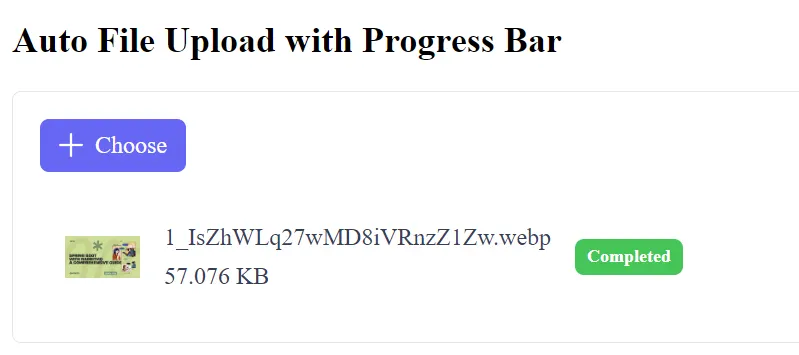
4. Auto upload
Creating an auto upload with a progress bar in an Angular 20 application using PrimeNG’s p-fileUpload component is straightforward, as PrimeNG handles the UI and automatic progress tracking when using its default upload mechanism.
The key to enabling auto-upload is setting the [auto]="true" property, and the progress bar is displayed automatically when the component is in advanced mode (the default mode).
Example Code
<div class="card">
    <p-toast></p-toast>

    <h2>Auto File Upload with Progress Bar</h2>

    <p-fileUpload
      name="demo[]"
      [url]="uploadUrl"
      [multiple]="true"
      accept="image/*"
      maxFileSize="1000000"
      (onUpload)="onUpload($event)"
      [auto]="true"
    />
</div>
PrimeNG provides a public endpoint for demoing uploads:
uploadUrl: string = 'https://www.primefaces.org/cdn/api/upload.php';
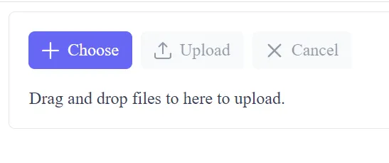
5. Custom Upload Example (Advanced)
To achieve a custom upload with a progress bar in PrimeNG, you’ll set [customUpload]="true" and define the logic in the (uploadHandler) event.
<div class="card">
    <p-toast />
    <p-fileupload name="demo[]" url="https://www.primefaces.org/cdn/api/upload.php" (onUpload)="onUpload($event)" [multiple]="true" accept="image/*" maxFileSize="1000000" mode="advanced">
        <ng-template #empty>
            <div>Drag and drop files to here to upload.</div>
        </ng-template>
    </p-fileupload>
</div>
import { Component } from '@angular/core';
import { MessageService } from 'primeng/api';
import { FileUploadModule, UploadEvent } from 'primeng/fileupload';
import { ProgressBarModule } from 'primeng/progressbar';
import { ToastModule } from 'primeng/toast';
import { ButtonModule } from 'primeng/button';
@Component({
standalone: true,
selector: 'app-file-upload',
templateUrl: './file-upload.html',
styleUrls: ['./file-upload.css'],
providers: [MessageService],
imports: [FileUploadModule, ProgressBarModule, ToastModule, ButtonModule],
})
export class FileUploadComponent {
uploadedFiles: any[] = [];
uploadProgress: number = 0;
onUpload(event: any) {
console.log('uploading');
for (let file of event.files) {
this.uploadedFiles.push(file);
}
}
}
6. Security & Validation (The Most Important Part)
Security is a Defense-in-Depth job — validation must happen on both the client (for UX) and the server (for security).
Frontend Validation (PrimeNG Properties)
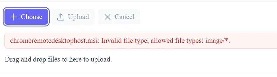
Use PrimeNG’s built-in properties for quick, client-side feedback:
- File Type Restriction (
accept): - Good:
accept="image/jpeg,image/png,application/pdf" - Bad:
accept="*"(Allows everything) - File Size Limit (
maxFileSize): - Set a reasonable limit (e.g.,
maxFileSize="5000000"for 5MB). This prevents users from wasting bandwidth on large files that the server will reject anyway. - Prevent Directory Traversal: Ensure the file name used in your
FormDatadoes not contain directory traversal sequences like../or similar special characters, although PrimeNG and the browser usually handle this.
7. User Experience (UX)
Provide clear, helpful feedback to the user throughout the process.
Clear Feedback Messages
- Success: Use
p-toast(as shown in the example) to confirm the upload is complete. - Errors: Use
p-toastwithseverity: 'error'for all failures (validation, network, or server rejection). - In Progress: The progress bar itself provides the best feedback, but you can also disable other UI elements (such as the submit button on a surrounding form) while an upload is in progress.
Finally
Delivering a Sleek, Real-App-Ready Upload Feature. We’ve built a modern file upload system using PrimeNG’s p-fileUpload. You learned how to:
- Configure Angular 20 with PrimeNG
- Generate real-time previews
This tutorial mirrors real-world requirements for responsive applications. Developers can now extend this system to connect with REST APIs, AWS S3, or Firebase Storage.
With thoughtful UI design and structured feedback, users stay informed and confident as they interact with your application.
Keep refining the design by adding drag-and-drop enhancements, dark mode, or custom animations. The foundation you’ve built is strong, scalable, and ready for integration in any modern Angular project.
This article was originally published on Medium.