
Creating an engaging shopping interface demands clarity, speed, and structure. Modern users expect simple navigation, responsive layouts, and a smooth product exploration experience. Fortunately, Angular 20 and PrimeNG offer powerful tools that transform these expectations into reality. Today, you will learn how to build a clean and visually appealing e-commerce product catalog with PrimeNG’s Card component. Additionally, you will integrate search filters, a dynamic product grid, a featured carousel, and a functional cart powered by localStorage.
This tutorial walks you through creating a delightful shopping experience step by step. Every section uses active voice, transitions effectively, and keeps sentences short to ensure easy learning. Let’s begin building your catalog.
Setting Up the Project

Directory Structure for the E-Commerce Catalog
A clean directory structure keeps your Angular 20 project organized and scalable. Below is a recommended structure for the e-commerce catalog using PrimeNG components, filters, and cart logic.
primeng-catalog/
├─ package.json
├─ tsconfig.json
├─ angular.json
├─ src/
│  ├─ main.ts
│  ├─ index.html
│  ├─ public/
│  │  ├─ img/
│  │  │  ├─ headphones.jpg
│  │  │  ├─ shoes.jpg
│  │  │  └─ placeholder.png
│  └─ app/
│     ├─ app.module.ts
│     ├─ app.ts
│     ├─ app.html
│     ├─ app.scss
│     ├─ models/
│     │  └─ product.model.ts
│     ├─ services/
│     │  ├─ product.service.ts
│     │  └─ cart.service.ts
│     ├─ pages/
│     │  ├─ catalog/
│     │  │  ├─ catalog.ts
│     │  │  ├─ catalog.html
│     │  │  └─ catalog.scss
│     │  └─ cart/
│     │     ├─ cart.ts
│     │     ├─ cart.html
│     │     └─ cart.scss
│     └─ component/
│        ├─ featured-carousel/
│        │  ├─ featured-carousel.ts
│        │  ├─ featured-carousel.html
│        │  └─ featured-carousel.scss
│        └─ product-card/
│           ├─ product-card.ts
│           ├─ product-card.html
│           └─ product-card.scss
Designing the Product Model and Fake Dataset
Your catalog needs structured product data. Define a simple product model using TypeScript. This model keeps your code clean and your UI predictable.
export interface Product {
  id: number;
  title: string;
  description: string;
  price: number;
  image: string;
  category: string;
  featured: boolean;
}
Then create a mock dataset. Real applications use APIs, but a static dataset works for this tutorial. Place the data inside a dedicated service file. This approach maintains modularity and prepares your project for future expansion.
import { Injectable } from '@angular/core';
import { Product } from '../../models/product.model';

@Injectable({ providedIn: 'root' })
export class ProductService {
  private products: Product[] = [
    {
      id: 1,
      title: 'Wireless Headphones',
      description: 'Comfortable and crisp sound.',
      price: 89,
      image: 'assets/img/headphones.jpg',
      category: 'Electronics',
      featured: true,
    },
    {
      id: 2,
      title: 'Sports Shoes',
      description: 'Lightweight and durable.',
      price: 120,
      image: 'assets/img/shoes.jpg',
      category: 'Fashion',
      featured: false,
    },
    // Add more examples
  ];

  getProducts(): Product[] {
    return this.products;
  }
}
You now have structured content ready to display. Next, you will render these products using PrimeNG’s Card component.
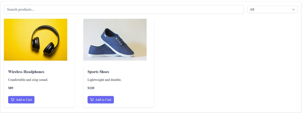
Displaying Products With PrimeNG Card
PrimeNG Card presents product information in a clean format. It offers a header, body text, and an optional footer. These sections let you easily highlight images, titles, and pricing details.
Begin by importing the CardModule inside your main feature module.
import { CardModule } from 'primeng/card';

@NgModule({
  imports: [
    CommonModule,
    CardModule
  ]
})
export class CatalogModule {}
Then create your product grid component. This component loops through your dataset and displays each product card. Use Flexbox or PrimeNG’s Grid utilities to organize them.
<div class="grid">
  <div class="col-12 md:col-4" *ngFor="let product of products">
    <p-card>
      <ng-template pTemplate="header">
        <img [src]="product.image" alt="{{ product.title }}" class="product-img" />
      </ng-template>

      <h3>{{ product.title }}</h3>
      <p>{{ product.description }}</p>
      <h4>\${{ product.price }}</h4>

      <ng-template pTemplate="footer">
        <button pButton label="Add to Cart" (click)="addToCart(product)"></button>
      </ng-template>
    </p-card>
  </div>
</div>
With this layout, each product appears in a structured box. Users can browse items comfortably and clearly. Now you can enrich the experience using filters.
Adding Search and Category Filters
Shoppers want fast access to relevant products. Therefore, you must implement search and category filtering. These simple features improve navigation and boost engagement.
Start by adding a search input. PrimeNG provides an elegant InputText component. Bind user input to a search term, and filter the dataset reactively.
<div class="mb-3">
  <input
    type="text"
    pInputText
    placeholder="Search products..."
    [(ngModel)]="searchTerm"
    (input)="applyFilters()"
  />
</div>
Add a category dropdown next. Use PrimeNG’s Dropdown component. Populate it with available categories.
<p-dropdown
  [options]="categories"
  optionLabel="label"
  placeholder="Filter by category"
  [(ngModel)]="selectedCategory"
  (onChange)="applyFilters()"
></p-dropdown>
Then implement the filtering logic:
applyFilters() {
  let data = [...this.products];

  if (this.searchTerm) {
    data = data.filter(p =>
      p.title.toLowerCase().includes(this.searchTerm.toLowerCase())
    );
  }

  if (this.selectedCategory) {
    data = data.filter(p =>
      p.category === this.selectedCategory
    );
  }

  this.filteredProducts = data;
}
Your catalog now reacts instantly to user input. The experience becomes smooth and intuitive. Continue enhancing it by adding a cart.
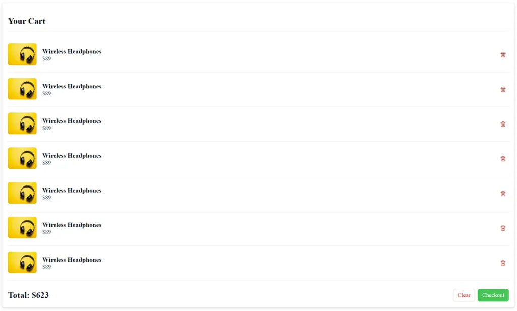
Implementing Cart Logic With localStorage
Most users expect carts to persist across sessions. localStorage solves this easily. It stores data in the browser with no expiration. You only need simple read and write operations.
Begin by creating a service to handle cart logic.
@Injectable({ providedIn: 'root' })
export class CartService {
  private key = 'cart';

  getCart(): Product[] {
    const data = localStorage.getItem(this.key);
    return data ? JSON.parse(data) : [];
  }

  addItem(product: Product) {
    const cart = this.getCart();
    cart.push(product);
    localStorage.setItem(this.key, JSON.stringify(cart));
  }

  removeItem(id: number) {
    const cart = this.getCart().filter(p => p.id !== id);
    localStorage.setItem(this.key, JSON.stringify(cart));
  }
}
Next, connect your product cards to the service.
addToCart(product: Product) {
  this.cartService.addItem(product);
}
This system works reliably. Users can add items, refresh the page, and still see stored products. You can later extend this into a full checkout flow.
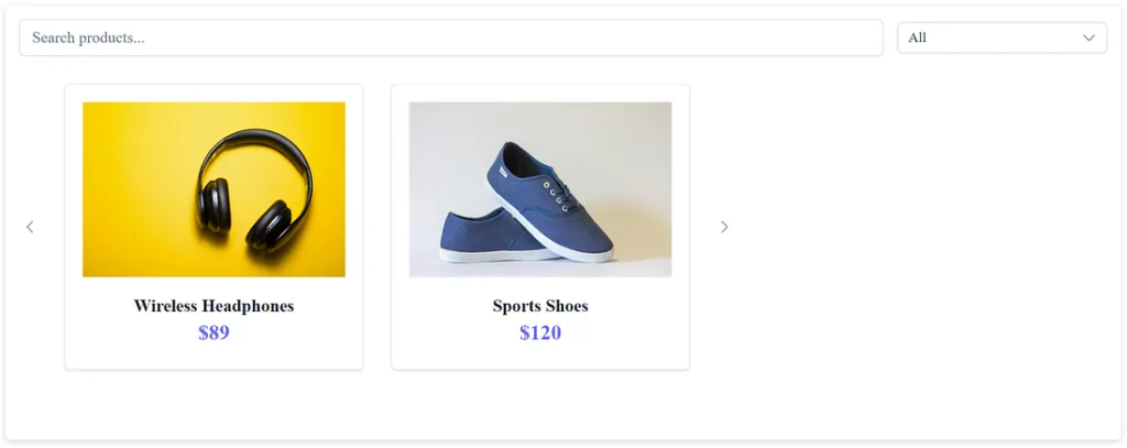
Creating a Responsive Featured Carousel
Featured products increase conversions because they catch attention quickly. A carousel helps present them beautifully, especially on mobile. PrimeNG’s Carousel component is responsive and easy to configure.
Start by importing the Carousel module.
import { CarouselModule } from 'primeng/carousel';Then filter your dataset to include only featured items.
featured = this.service.getProducts().filter(p => p.featured);
Create the carousel in HTML.
<section class="mb-3">
    <div class="card">
        <p-carousel [value]="featured" [numVisible]="3" [numScroll]="1" [responsiveOptions]="responsiveOptions">
            <ng-template let-product #item>
                <div class="border border-surface-200 dark:border-surface-700 rounded m-2 p-4">
                    <div class="p-3">
                        <p-card
                            class="p-card-content surface-section border-round border-1 surface-border hover:shadow-4 transition-shadow transition-duration-300">
                            <div class="flex flex-column align-items-center text-center">

                                <div class="w-full overflow-hidden mb-3">
                                    <img [src]="product.image" alt="{{ product.title }}" width="300" height="200" />
                                </div>

                                <h4 class="mt-0 mb-1 text-xl font-semibold text-900 line-height-2">{{ product.title }}
                                </h4>
                                <p class="text-2xl font-bold text-primary mt-0 mb-2">${{ product.price }}</p>
                            </div>
                        </p-card>
                    </div>
                </div>
            </ng-template>
        </p-carousel>
    </div>
</section>
The carousel automatically adapts to smaller screens. It displays 1 item on phones, two on tablets, and three on desktops. This behavior ensures a consistent and attractive experience for all users.
Create a simple project.
Generated a complete project layout and full source files for an Angular and PrimeNG e-commerce catalog.
Models
src/app/models/product.model.ts
export interface Product {
  id: number;
  title: string;
  description: string;
  price: number;
  image: string;
  category: string;
  featured: boolean;
}
Services
src/app/services/product.service.ts
import { Injectable } from '@angular/core';
import { Product } from '../../models/product.model';

@Injectable({ providedIn: 'root' })
export class ProductService {
  private products: Product[] = [
    {
      id: 1,
      title: 'Wireless Headphones',
      description: 'Comfortable and crisp sound.',
      price: 89,
      image: '/img/headphones.jpg',
      category: 'Electronics',
      featured: true,
    },
    {
      id: 2,
      title: 'Sports Shoes',
      description: 'Lightweight and durable.',
      price: 120,
      image: '/img/shoes.jpg',
      category: 'Fashion',
      featured: false,
    },
    // Add more examples
  ];

  getProducts(): Product[] {
    return this.products;
  }
}
src/app/services/cart.service.ts
import { Inject, Injectable, PLATFORM_ID } from '@angular/core';
import { Product } from '../../models/product.model';
import { isPlatformBrowser } from '@angular/common';

@Injectable({ providedIn: 'root' })
export class CartService {
  private key = 'primeng_cart';

  constructor(@Inject(PLATFORM_ID) private platformId: Object) {}

  ngOnInit(): void {
    if (isPlatformBrowser(this.platformId)) {
    }
  }

  getCart(): Product[] {
    const raw = isPlatformBrowser(this.platformId) ? localStorage.getItem(this.key) : null;
    return raw ? JSON.parse(raw) : [];
  }

  addItem(p: Product) {
    const cart = this.getCart();
    cart.push(p);
    localStorage.setItem(this.key, JSON.stringify(cart));
  }

  removeItem(id: number) {
    const cart = this.getCart().filter((x) => x.id !== id);
    localStorage.setItem(this.key, JSON.stringify(cart));
  }

  clear() {
    localStorage.removeItem(this.key);
  }
}
UI Components
ng generate component product-card
src/app/component/product-card/product-card.ts
import { Component, Input } from '@angular/core';
import { Product } from '../../models/product.model';
import { CartService } from '../services/cart.service';
import { Card } from 'primeng/card';
import { ButtonModule } from 'primeng/button';

@Component({
  selector: 'app-product-card',
  templateUrl: './product-card.html',
  styleUrls: ['./product-card.css'],
  imports: [Card, ButtonModule],
})
export class ProductCardComponent {
  @Input() product!: Product;

  constructor(private cart: CartService) {}

  addToCart() {
    console.log(this.product);
    this.cart.addItem(this.product);
  }
}
src/app/ui/product-card/product-card.html
<p-card>
    <ng-template #header>
        <img [src]="product.image" alt="{{ product.title }}" style="width: 300px; height: 200px; object-fit: cover;" />
    </ng-template>

    <h3>{{ product.title }}</h3>
    <p>{{ product.description }}</p>
    <h4>${{ product.price }}</h4>

    <ng-template #footer>
        <p-button label="Add to Cart" icon="pi pi-shopping-cart" (click)="addToCart()"></p-button>
    </ng-template>
</p-card>
Create a component featured crousel.
ng generate component featured-carousel
src/app/component/featured-carousel/featured-carousel.ts
import { Component } from '@angular/core';
import { Product } from '../../models/product.model';
import { ProductService } from '../services/product.service';
import { CarouselModule } from 'primeng/carousel';
import { CardModule } from 'primeng/card';

@Component({
  selector: 'app-featured-carousel',
  templateUrl: './featured-carousel.html',
  styleUrls: ['./featured-carousel.css'],
  imports: [CarouselModule, CardModule],
})
export class FeaturedCarouselComponent {
  featured: Product[] = [];

  constructor(private ps: ProductService) {
    this.featured = this.ps.getProducts();
  }

  responsiveOptions: any[] | undefined;

  ngOnInit() {
    this.responsiveOptions = [
      {
        breakpoint: '1400px',
        numVisible: 2,
        numScroll: 1,
      },
      {
        breakpoint: '1199px',
        numVisible: 3,
        numScroll: 1,
      },
      {
        breakpoint: '767px',
        numVisible: 2,
        numScroll: 1,
      },
      {
        breakpoint: '575px',
        numVisible: 1,
        numScroll: 1,
      },
    ];
  }
}
src/app/component/featured-carousel/featured-carousel.html
<section class="mb-3">
    <div class="card">
        <p-carousel [value]="featured" [numVisible]="3" [numScroll]="1" [responsiveOptions]="responsiveOptions">
            <ng-template let-product #item>
                <div class="border border-surface-200 dark:border-surface-700 rounded m-2 p-4">
                    <div class="p-3">
                        <p-card
                            class="p-card-content surface-section border-round border-1 surface-border hover:shadow-4 transition-shadow transition-duration-300">
                            <div class="flex flex-column align-items-center text-center">

                                <div class="w-full overflow-hidden mb-3">
                                    <img [src]="product.image" alt="{{ product.title }}" width="300" height="200" />
                                </div>

                                <h4 class="mt-0 mb-1 text-xl font-semibold text-900 line-height-2">{{ product.title }}
                                </h4>
                                <p class="text-2xl font-bold text-primary mt-0 mb-2">${{ product.price }}</p>
                            </div>
                        </p-card>
                    </div>
                </div>
            </ng-template>
        </p-carousel>
    </div>
</section>
Pages
ng generate component pages/catalog
src/app/pages/catalog/catalog.ts
import { Component, OnInit } from '@angular/core';
import { Product } from '../../../models/product.model';
import { ProductService } from '../../services/product.service';
import { CardModule } from 'primeng/card';
import { ProductCardComponent } from '../../product-card/product-card';
import { SelectModule } from 'primeng/select';
import { InputTextModule } from 'primeng/inputtext';
import { FormsModule } from '@angular/forms';
import { FeaturedCarouselComponent } from '../../featured-carousel/featured-carousel';

@Component({
  selector: 'app-catalog',
  templateUrl: './catalog.html',
  styleUrls: ['./catalog.css'],
  imports: [
    CardModule,
    ProductCardComponent,
    SelectModule,
    InputTextModule,
    FormsModule,
    FeaturedCarouselComponent,
  ],
})
export class CatalogComponent implements OnInit {
  products: Product[] = [];
  filteredProducts: Product[] = [];
  searchTerm = '';
  categories: string[] = [];
  selectedCategory = 'All';

  constructor(private ps: ProductService) {}

  ngOnInit() {
    this.products = this.ps.getProducts();
    this.filteredProducts = [...this.products];
    this.categories = this.products
      .map((p) => p.category)
      .filter((value, index, self) => self.indexOf(value) === index);
    this.categories.unshift('All');
  }

  applyFilters() {
    let data = [...this.products];

    if (this.searchTerm?.trim()) {
      const q = this.searchTerm.toLowerCase();
      data = data.filter(
        (p) => p.title.toLowerCase().includes(q) || p.description.toLowerCase().includes(q)
      );
    }

    if (this.selectedCategory && this.selectedCategory !== 'All') {
      data = data.filter((p) => p.category === this.selectedCategory);
    }

    this.filteredProducts = data;
  }
}
src/app/pages/catalog/catalog.html
<section class="mb-5 p-3 surface-card border-round shadow-2">

    <div class="flex flex-wrap align-items-center gap-3 mb-4">

        <div class="flex-grow-1">
            <span class="p-input-icon-left w-full">
                <input pInputText placeholder="Search products..." [(ngModel)]="searchTerm" (input)="applyFilters()"
                    class="p-inputtext-lg w-full" />
            </span>
        </div>

        <div class="w-full md:w-15rem">
            <p-select [options]="categories" [(ngModel)]="selectedCategory" (onChange)="applyFilters()" class="w-full"
                placeholder="All Categories"></p-select>
        </div>

    </div>

    <div class="grid lg:gap-4">
        @for (p of filteredProducts; track p.id) {
        <div class="col-12 sm:col-6 md:col-4 lg:col-3">
            <app-product-card [product]="p"></app-product-card>
        </div>
        }
    </div>
</section>
src/app/pages/catalog/catalog.scss
/* small adjustments */
p-dropdown { width: 220px; }
ng generate component pages/cart
src/app/pages/cart/cart.ts
import { Component } from '@angular/core';
import { CartService } from '../../services/cart.service';
import { Product } from '../../../models/product.model';
import { ButtonModule } from 'primeng/button';

@Component({
  selector: 'app-cart',
  templateUrl: './cart.html',
  styleUrls: ['./cart.css'],
  imports: [ButtonModule],
})
export class CartComponent {
  items: Product[] = [];

  constructor(private cart: CartService) {
    this.items = this.cart.getCart();
  }

  remove(id: number) {
    this.cart.removeItem(id);
    this.items = this.cart.getCart();
  }

  clear() {
    this.cart.clear();
    this.items = [];
  }

  get total() {
    return this.items.reduce((s, i) => s + i.price, 0);
  }
}
src/app/pages/cart/cart.html
<section class="mb-5 p-3 surface-card border-round shadow-2">
    <h2 class="text-2xl font-bold mb-4 border-bottom-1 surface-border pb-2">Your Cart</h2>

    @if (items.length === 0) {
    <div class="text-center py-5">
        <i class="pi pi-shopping-bag text-5xl text-400 mb-3"></i>
        <p class="text-xl text-600">Your cart is empty.</p>
    </div>
    }

    @if (items.length) {
    <div class="p-fluid">
        @for (item of items; track item.id) {
        <div class="flex align-items-center py-3 border-bottom-1 surface-border">

            <div class="mr-3 flex-shrink-0">
                <img [src]="item.image" alt="{{ item.title }}" width="80" height="60" class="border-round"
                    style="object-fit:cover;" />
            </div>

            <div class="flex-grow-1 flex-column">
                <strong class="text-lg text-900 line-height-2">{{ item.title }}</strong>
                <div class="text-md text-600">${{ item.price }}</div>
            </div>

            <p-button icon="pi pi-trash" styleClass="p-button-danger p-button-sm p-button-text"
                (click)="remove(item.id)"></p-button>
        </div>
        }

        <div class="flex justify-content-between align-items-center pt-4">
            <h3 class="text-2xl font-bold text-900 m-0">Total: ${{ total }}</h3>

            <div class="flex gap-2">
                <p-button label="Clear" (click)="clear()" styleClass="p-button-danger p-button-outlined"></p-button>

                <p-button label="Checkout" styleClass="p-button-success"></p-button>
            </div>
        </div>
    </div>
    }
</section>
Assets images
Add images at src/public/img/.
Use your own images.
You can temporarily use placeholder images.
I included names: headphones.jpg, shoes.jpg, placeholder.png.
Start an application
ng serve
http://localhost:4200/catalog
http://localhost:4200/cart
Final Thoughts and Next Steps
You now have a complete e-commerce catalog built with Angular 20 and PrimeNG. It includes:
- A responsive product grid
- Search and category filters
- PrimeNG Card-based layouts
- A featured product carousel
- A persistent cart using
localStorage - Clean micro-interactions for better UX
The result delivers a visually appealing and user-friendly shopping experience. Future improvements may include pagination, user accounts, API integration, and checkout pages. Each addition can expand your catalog into a complete e-commerce platform.
This article was originally published on Medium.