
Modern admin interfaces demand flexibility. Instead of hardcoding every form, developers now prefer dynamic forms. A dynamic form generator enables teams to define form structures using JSON schemas, thereby dramatically improving maintainability and scalability.
In this tutorial, we’ll build a reusable Dynamic Form Generator using Angular 20 and PrimeNG. You’ll learn how to:
- Render forms dynamically using JSON-based configuration.
- Integrate PrimeNG components like
p-inputText,p-dropdown, andp-calendar. - Handle validations dynamically.
- Reuse the form generator across multiple admin UIs.
Why Use Dynamic Forms?
Dynamic forms let you define inputs, dropdowns, and validation rules in a structured format. This approach helps reduce repetitive code while improving flexibility.
Imagine changing a field name or validation rule without modifying your TypeScript components. You update a JSON configuration file, and your UI updates automatically. This is the power of dynamic rendering.
Setting Up the Angular Project

Project Structure
A well-organized project structure ensures scalability and readability. When building a Dynamic Form Generator in Angular 20, a modular structure helps separate configuration, logic, and presentation layers. Below is a recommended structure:
src/
 ├── app/
 │    ├── dynamic-form/
 │    │    ├── dynamic-form.ts
 │    │    ├── dynamic-form.html
 │    │    ├── dynamic-form.css
 │    │    ├── dynamic-field/
 │    │    │    ├── dynamic-field.directive.ts
 │    │    │    └── field-interfaces.ts
 │    │    └── form-schema.ts
 │    ├── services/
 │    │    └── form-loader.service.ts
 │    ├── app.ts
 │    ├── app.html
 │    └── app.module.ts
 ├── assets/
 │    └── form-configs/
 │         ├── user-form.json
 │         └── product-form.json
 ├── environments/
 │    ├── environment.ts
 │    └── environment.prod.ts
 └── main.ts
Defining the Form Schema
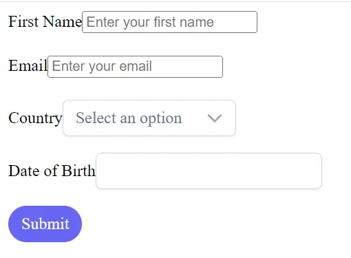
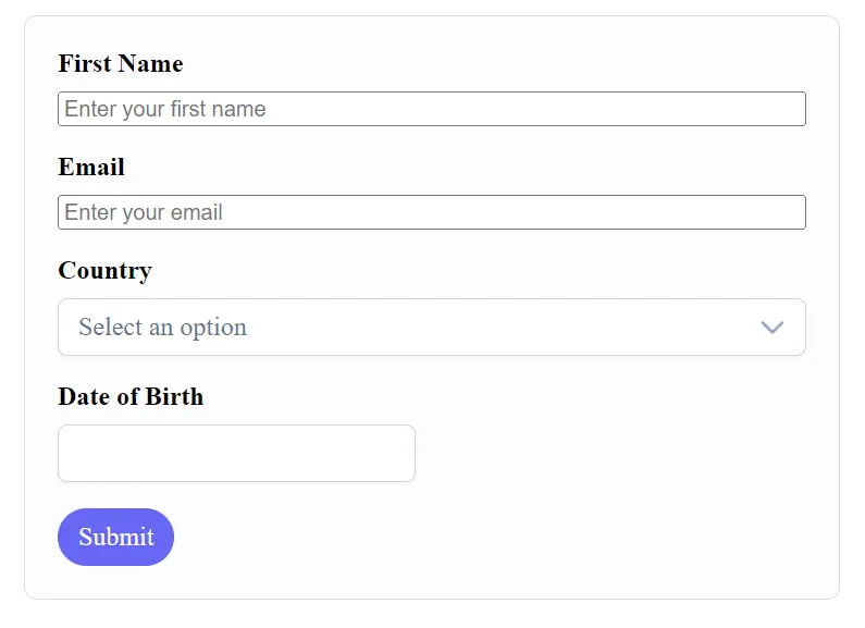
We will describe each field using JSON. Here’s an example schema:
form-schema.ts
export const FORM_SCHEMA = [
  {
    type: 'input',
    label: 'First Name',
    name: 'firstName',
    placeholder: 'Enter your first name',
    validation: { required: true, minLength: 3 }
  },
  {
    type: 'input',
    label: 'Email',
    name: 'email',
    placeholder: 'Enter your email',
    validation: { required: true, email: true }
  },
  {
    type: 'dropdown',
    label: 'Country',
    name: 'country',
    options: [
      { label: 'USA', value: 'us' },
      { label: 'Canada', value: 'ca' },
      { label: 'UK', value: 'uk' }
    ],
    validation: { required: true }
  },
  {
    type: 'calendar',
    label: 'Date of Birth',
    name: 'dob',
    validation: { required: true }
  }
];
Each object represents a field. The type determines which PrimeNG component to render. The validation object defines dynamic rules.
Building the Dynamic Form Component
Component Setup
import { Component, Input, OnInit } from '@angular/core';
import { FormBuilder, FormGroup, Validators } from '@angular/forms';
import { SelectModule } from 'primeng/select';
import { FormsModule } from '@angular/forms';
import { ReactiveFormsModule } from '@angular/forms';
import { DatePickerModule } from 'primeng/datepicker';
import { FORM_SCHEMA } from './form-schema';
import { ButtonModule } from 'primeng/button';

@Component({
  selector: 'app-dynamic-form',
  templateUrl: './dynamic-form.html',
  styleUrls: ['./dynamic-form.css'],
  imports: [SelectModule, FormsModule, ReactiveFormsModule, DatePickerModule, ButtonModule],
})
export class DynamicFormComponent implements OnInit {
  @Input() config: any[] = FORM_SCHEMA;
  dynamicForm!: FormGroup;

  constructor(private fb: FormBuilder) {}

  ngOnInit() {
    this.buildForm();
  }

  buildForm() {
    const group: any = {};
    this.config.forEach(field => {
      const validators = [];
      if (field.validation) {
        if (field.validation.required) validators.push(Validators.required);
        if (field.validation.minLength)
          validators.push(Validators.minLength(field.validation.minLength));
        if (field.validation.email) validators.push(Validators.email);
      }
      group[field.name] = ['', validators];
    });
    this.dynamicForm = this.fb.group(group);
  }

  onSubmit() {
    if (this.dynamicForm.valid) {
      console.log('Form Data:', this.dynamicForm.value);
    } else {
      console.log('Form Invalid');
    }
  }

}
This code dynamically creates a form group based on the JSON configuration. Each field’s validators are attached programmatically.
Rendering the Dynamic Fields
Create a file named dynamic-form.html:
<form [formGroup]="dynamicForm" (ngSubmit)="onSubmit()">

    @for (field of config; track field.name) {

        @switch (field.type) {

            @case ('input') {
                <div class="field">
                    <label>{{ field.label }}</label>
                    <input
                        pInputText
                        (ngModel)="dynamicForm.get(field.name)?.value"
                        (ngModelChange)="dynamicForm.get(field.name)?.setValue($event)"
                        [placeholder]="field.placeholder"
                    />

                    @if (dynamicForm.get(field.name)?.invalid && dynamicForm.get(field.name)?.touched) {
                        <small>
                            {{ field.label }} is invalid
                        </small>
                    }
                </div>
            }

            @case ('dropdown') {
                <div class="field">
                    <label>{{ field.label }}</label>
                    <p-select
                        [options]="field.options"
                        (ngModel)="dynamicForm.get(field.name)?.value"
                        (ngModelChange)="dynamicForm.get(field.name)?.setValue($event)"
                        placeholder="Select an option"
                    ></p-select>
                </div>
            }

            @case ('calendar') {
                <div class="field">
                    <label>{{ field.label }}</label>
                    <p-datepicker
                        (ngModel)="dynamicForm.get(field.name)?.value"
                        (ngModelChange)="dynamicForm.get(field.name)?.setValue($event)"
                        dateFormat="yy-mm-dd"
                    ></p-datepicker>
                </div>
            }

            @default {
                <div class="field">
                    <p>Unsupported field type: {{ field.type }}</p>
                </div>
            }
        }

    }

    @empty {
        <p>No configuration fields defined.</p>
    }


      <div class="block border-round">
        <button
          pButton
          type="submit"
          label="Submit"
          class="p-button-rounded p-button-primary"
        ></button>
      </div>
</form>
Each block uses PrimeNG components. The ngSwitch directive ensures that the correct input type is rendered for each field.
Handling Validation Dynamically
Dynamic validation is key. The component already attaches validators during form creation. Let’s enhance error display.
Add this function to the component:
getErrorMessage(field: any): string {
  const control = this.form.get(field.name);
  if (control?.hasError('required')) return `${field.label} is required`;
  if (control?.hasError('email')) return `Invalid email address`;
  if (control?.hasError('minlength'))
    return `${field.label} must be at least ${field.validation.minLength} characters`;
  return '';
}
Update the template to use this:
@if (form.get(field.name)?.touched && form.get(field.name)?.invalid) {
  <small class="error">
    {{ getErrorMessage(field) }}
  </small>
}
Using the Dynamic Form
In app.component.ts:
import { FORM_SCHEMA } from './form-schema';
export class DynamicFormComponent implements OnInit {
  @Input() config: any[] = FORM_SCHEMA;
  dynamicForm!: FormGroup;
...
You can now see a fully working form rendered directly from the JSON configuration.
Adding More Component Types
A dynamic form should be extensible. You might need checkboxes, radio buttons, sliders, or file uploaders. PrimeNG makes this easy.
Example: Adding Checkboxes
Add this case to your HTML:
@case ('checkbox') {
    <div class="field">
        <label>
            <p-checkbox
            (ngModel)="dynamicForm.get(field.name)?.value"
            (ngModelChange)="dynamicForm.get(field.name)?.setValue($event)"
            binary="true"></p-checkbox>
            {{ field.label }}
        </label>
    </div>
}
Add an entry to your schema:
{
  type: 'checkbox',
  label: 'Accept Terms',
  name: 'terms',
  validation: { required: true }
}
Example: Adding TextArea
PrimeNG provides pInputTextarea for larger text fields.
@case ('textarea') {
    <div class="field">
        <label>{{ field.label }}</label>
        <textarea
            pInputTextarea
            (ngModel)="dynamicForm.get(field.name)?.value"
            (ngModelChange)="dynamicForm.get(field.name)?.setValue($event)"
            [placeholder]="field.placeholder"
        ></textarea>
     </div>
}
This modularity ensures that your form generator supports various input types without requiring logic to be rewritten.
Styling and UX Improvements
A professional UI increases form usability. PrimeNG offers elegant themes, but custom styles make your generator stand out.
Add these to dynamic-form.css:
form {
  max-width: 500px;
  margin: 20px auto;
  padding: 20px;
  border: 1px solid #dcdcdc;
  border-radius: 8px;
  background-color: #fdfdfd;
}

.field {
  margin-bottom: 16px;
  display: flex;
  flex-direction: column;
}

label {
  font-weight: 600;
  margin-bottom: 8px;
}

.error {
  color: #d93025;
  font-size: 0.8rem;
}
Add PrimeNG’s grid system for a responsive layout. Use <div class="p-fluid"> to adjust inputs to fit the screen width.
Improving UX is not just about visuals. Include default placeholders, auto-focus, and real-time validation feedback. A well-designed form reduces user frustration and errors.
Dynamic Layouts from JSON
Layouts can also come from JSON. Suppose your form schema defines columns:
{
  type: 'input',
  label: 'City',
  name: 'city',
  layout: { column: 6 }
}
You can interpret this in the HTML:
<div [class]="'p-col-' + (field.layout?.column || 12)">
  <!-- Render field -->
</div>
Combine this with the PrimeFlex grid system:
<div class="p-grid">
  @for (field of config; track field.name) {
    <div [class]="'p-col-' + (field.layout?.column || 12)">
      </div>
  } @empty {
    <p>No form configuration available.</p>
  }
</div>
This approach allows admin panels to define both form structure and layout purely from configuration files.
Handling Dependent Fields
Dynamic forms often have fields dependent on others. For instance, selecting a country may determine which states are available.
We can handle this with reactive value changes:
ngOnInit() {
  this.buildForm();
  this.handleDependencies();
}

handleDependencies() {
  const countryControl = this.form.get('country');
  if (countryControl) {
    countryControl.valueChanges.subscribe(value => {
      const stateField = this.config.find(f => f.name === 'state');
      if (stateField) {
        if (value === 'us') {
          stateField.options = [
            { label: 'California', value: 'CA' },
            { label: 'Texas', value: 'TX' }
          ];
        } else {
          stateField.options = [];
        }
      }
    });
  }
}
Now, the dropdown for states updates dynamically based on the value of another field.
Submitting Data to the Server
Submitting form data to an API is simple once you have dynamic controls in place. Use Angular’s HttpClient to send the form data.
Add it to your constructor:
import { HttpClient } from '@angular/common/http';

constructor(private fb: FormBuilder, private http: HttpClient) {}
Then modify onSubmit():
onSubmit() {
  if (this.form.valid) {
    this.http.post('/api/submit', this.form.value).subscribe({
      next: response => console.log('Submitted:', response),
      error: err => console.error('Error:', err)
    });
  }
}
By keeping configuration-driven logic, you can even define API endpoints in your JSON.
Reusability in Admin Panels
Once you have this generator, you can plug it into any admin module. Pass new configurations from APIs or static JSON files.
For example:
this.http.get('/api/form-config/user-profile').subscribe(config => {
  this.formConfig = config;
});
You can even store form schemas in a database. This enables an actual form builder experience, where non-developers design forms through a UI.
Admin teams can manage dynamic workflows — such as creating onboarding forms or configuration editors — without needing to touch code.
Performance Optimization
For large forms, performance can degrade. To optimize:
1. Use trackBy in @for to prevent unnecessary DOM updates:
@for (field of config; track field.name) {}2. Use lazy loading for form schemas.
3. Cache configuration files using Angular’s HttpInterceptor.
4. Minimize DOM watchers by reducing unnecessary bindings.
These improvements help ensure smooth rendering even with dozens of fields.
Finally
You’ve now built a fully dynamic, reusable Form Generator in Angular 20 with PrimeNG. Your solution supports JSON-based configuration, real-time validation, and component extensibility.
This approach transforms how admin interfaces are designed. Developers can now focus on logic, while configuration defines structure.
To take it further:
- Add file uploads and multi-step forms.
- Integrate PrimeNG dialogs for pop-up forms.
- Implement dynamic validators fetched from APIs.
Dynamic forms empower teams to build flexible, future-proof applications with minimal code duplication.
By leveraging PrimeNG’s rich UI components and Angular’s reactive forms, you can create enterprise-grade admin tools that adapt instantly to configuration changes.
This article was originally published on Medium.