Building modern web applications can feel overwhelming. You want speed, flexibility, and elegance — all at once. Fortunately, Angular and PrimeNG offer a perfect combination for developers who aspire to craft beautiful, high-performance apps with ease.
Angular, developed by Google, is a robust front-end framework. It brings order and structure to your projects. Meanwhile, PrimeNG, a component library, adds design brilliance. It empowers developers to create stunning, responsive, and accessible interfaces in minutes.
In this tutorial, you’ll learn to create an Angular project from scratch. Then, you’ll integrate PrimeNG and build a simple, attractive interface. Step by step, you’ll gain confidence and clarity. Let’s begin your journey toward creating modern, professional web applications with Angular and PrimeNG.
Step 1: Setting Up Your Angular Environment
Before writing a single line of code, ensure your environment is set up and ready. Preparation is power.
First, install Node.js. It includes npm, the Node Package Manager, which helps manage your dependencies.
Check if Node.js is installed by typing:
node -v
npm -v
If these commands return versions, you’re good to go. Otherwise, download Node.js from nodejs.org and follow the installation instructions.
Next, install the Angular CLI. This tool automates the creation and configuration of Angular projects. Run:Next, install the Angular CLI. This tool automates the creation and configuration of Angular projects. Run:
npm install -g @angular/cli
After installation, verify it:
ng version
    / \   _ __   __ _ _   _| | __ _ _ __     / ___| |   |_ _|
   / △ \ | '_ \ / _` | | | | |/ _` | '__|   | |   | |    | |
  / ___ \| | | | (_| | |_| | | (_| | |      | |___| |___ | |
 /_/   \_\_| |_|\__, |\__,_|_|\__,_|_|       \____|_____|___|
                |___/


Angular CLI: 20.3.4
Node: 22.15.0
Package Manager: npm 11.3.0
OS: win32 x64


Angular: <error>

Package                      Version
------------------------------------
@angular-devkit/architect    0.2003.4 (cli-only)
@angular-devkit/core         20.3.4 (cli-only)
@angular-devkit/schematics   20.3.4 (cli-only)
@schematics/angular          20.3.4 (cli-only)
Now, you’re ready to create your first project. Use the following command:
ng new primeng-demo
Would you like to share pseudonymous usage data about this project with the Angular Team
at Google under Google's Privacy Policy at https://policies.google.com/privacy. For more
details and how to change this setting, see https://angular.dev/cli/analytics.

   Yes

Thank you for sharing pseudonymous usage data. Should you change your mind, the following
command will disable this feature entirely:

    ng analytics disable --global

Global setting: enabled
Local setting: No local workspace configuration file.
Effective status: enabled
✔ Which stylesheet format would you like to use? CSS             [ https://developer.mozilla.org/docs/Web/CSS                     ]
✔ Do you want to enable Server-Side Rendering (SSR) and Static Site Generation (SSG/Prerendering)? Yes
✔ Do you want to create a 'zoneless' application without zone.js? Yes
✔ Which AI tools do you want to configure with Angular best practices? https://angular.dev/ai/develop-with-ai None

...
Angular CLI will prompt you to choose styling options. Select CSS for simplicity. Once created, navigate into your project:
cd primeng-demo
Finally, start the development server:
ng serve
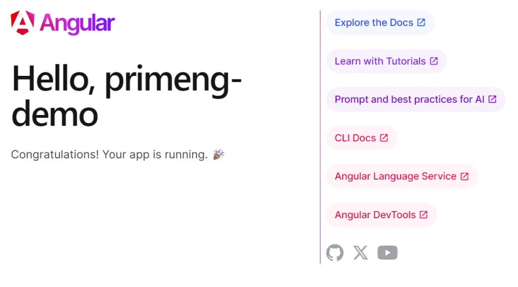
Open your browser and visit http://localhost:4200. You’ll see the default Angular welcome page. Congratulations! You’ve built the foundation of your project.
Step 2: Installing PrimeNG and PrimeIcons
With Angular ready, it’s time to bring PrimeNG to life. PrimeNG offers hundreds of UI components, from buttons to complex data tables. It’s built specifically for Angular, making integration seamless.
Install PrimeNG and PrimeIcons using npm:
npm install primeng primeicons @primeuix/themes
PrimeIcons provides essential icons for your interface. These icons enrich your buttons, menus, and alerts.
After installation, add providePrimeNG to the list of providers in your app.config.ts and use the theme property to configure a theme such as Aura.
import {
  ApplicationConfig,
  provideBrowserGlobalErrorListeners,
  provideZonelessChangeDetection,
} from '@angular/core';
import { provideRouter } from '@angular/router';

import { routes } from './app.routes';
import { provideClientHydration, withEventReplay } from '@angular/platform-browser';

import { providePrimeNG } from 'primeng/config';
import Aura from '@primeuix/themes/aura';

export const appConfig: ApplicationConfig = {
  providers: [
    provideBrowserGlobalErrorListeners(),
    provideZonelessChangeDetection(),
    provideRouter(routes),
    provideClientHydration(withEventReplay()),
    providePrimeNG({
      theme: {
        preset: Aura,
      },
    }),
  ],
};
These lines apply PrimeNG’s modern styling to your components. Save the file. Then restart the server with:
ng serve
Now, PrimeNG is ready to enhance your Angular project. Your application can now access world-class UI components with minimal effort.
Add icon
/* src/styles.css */

/* Keep the PrimeIcons import, which usually works as-is */
@import "primeicons/primeicons.css";
Step 3: Use a PrimeNG Component
Now you can use PrimeNG components in your standalone components. Let’s add a simple Button and an InputText to your app.ts.
A. Update app.ts
Import the specific module for the component you want to use into the imports array of the standalone component.
// src/app/app.ts
import { Component } from '@angular/core';
import { ButtonModule } from 'primeng/button';
import { InputTextModule } from 'primeng/inputtext';
import { FormsModule } from '@angular/forms'; // Required for ngModel
import { FloatLabelModule } from 'primeng/floatlabel';
import { CardModule } from 'primeng/card';
import { DividerModule } from 'primeng/divider';
@Component({
selector: 'app-root',
standalone: true,
imports: [
ButtonModule, // Import the button component module
InputTextModule, // Import the input text component module
FormsModule, // Import FormsModule for two-way binding (ngModel)
FloatLabelModule,
CardModule,
DividerModule,
],
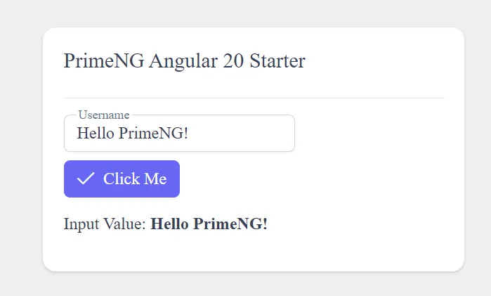
template: `
<div class="center-container">
<p-card [style]="{ width: '25rem', overflow: 'hidden' }">
<ng-template #title>PrimeNG Angular 20 Starter</ng-template>
<p-divider />
<p-floatlabel variant="on">
<input type="text" pInputText id="username" [(ngModel)]="value" />
<label for="username">Username</label>
</p-floatlabel>
<ng-template #footer>
<p-button
label="Click Me"
icon="pi pi-check"
(onClick)="handleClick()"
styleClass="p-button-primary"
></p-button>
<p>
Input Value: <strong>{{ value }}</strong>
</p>
</ng-template>
</p-card>
</div>
`,
styleUrl: './app.css',
})
export class App {
value: string = 'Hello PrimeNG!';
title = 'primeng-app';
handleClick() {
alert(`Button clicked! Input is: ${this.value}`);
}
}Launch an application
ng serve
Customizing the Theme
PrimeNG’s modern theming architecture, introduced in version 18+, uses Design Tokens and a utility called definePreset for customization. This is the recommended and most flexible approach.
There are three main ways to customize a PrimeNG theme:
1. Customizing the Theme via definePreset (Recommended)
This method allows you to override the Design Tokens of an existing base theme (such as Aura, Lara, Material, or Nora). This is typically done in TypeScript/JavaScript within your application’s configuration.
Create a Custom Preset File
Create a new file, for example, src/app/custom.preset.ts. You use the definePreset function to extend a base theme and provide your custom tokens.
// src/app/custom.preset.ts
import { definePreset } from '@primeuix/themes';
import Aura from '@primeuix/themes/aura'; // Choose a base theme

const MyCustomPreset = definePreset(Aura, {
  // Override Semantic Tokens (application-wide elements)
  semantic: {
    // 1. Customize the Primary Color Palette (50 to 950 shades)
    primary: {
      50: '#F0F8FF', // Lightest shade (light blue/cyan example)
      100: '#D5F2FF',
      200: '#A9E3FF',
      300: '#7DCFFF',
      400: '#52BFFF',
      500: '#26AEFF', // The main primary color
      600: '#008CFF',
      700: '#0070CC',
      800: '#005599',
      900: '#003966',
      950: '#001E33',
    },

    // 2. Customize General Styles (like border radius or surfaces)
    borderRadius: {
      sm: '4px', // Tighter radius for small elements
      md: '8px', // Larger radius for cards/buttons
    }
  },

  // Override Component Tokens (for a specific component only)
  components: {
    button: {
      root: {
        borderRadius: '{borderRadius.md}', // Use the new semantic token
        gap: '0.5rem',
      }
    }
  }
});

export default MyCustomPreset;
Apply the Custom Preset in app.config.ts
Import your custom preset and pass it to the providePrimeNG function.
// src/app/app.config.ts

// ... other imports
import { providePrimeNG } from 'primeng/config';
import MyCustomPreset from './custom.preset'; // Import your custom preset

export const appConfig: ApplicationConfig = {
  providers: [
    // ... other providers
    providePrimeNG({
      theme: {
        preset: MyCustomPreset, // Apply the custom preset
        // Optional: Configure dark mode selector
        // options: { darkModeSelector: '.app-dark' }
      }
    })
  ]
};
2. Overriding Styles for a Single Component
If you only need to change the style of a single component instance, you can use Scoped Design Tokens with the [dt] input property.
<p-button
  label="Custom Button"
  [dt]="{
    // This token is specific to the button component
    root: {
      background: '#FFD700', // Gold background
      color: '#000000'       // Black text
    }
  }">
</p-button>
3. CSS Overrides (The Traditional Way)
For minor, precise style changes that are not covered by design tokens, you can still use traditional CSS:
- Inspect the PrimeNG component to find the relevant CSS class.
- Add your custom CSS in your global stylesheet (e.g.,
styles.scss) or in a component’s style file.
Create a new page
With Angular, the recommended and modern approach to creating a new “page” is to use standalone components and Router-based Lazy Loading. This approach avoids the older, module-based system, resulting in simpler and more modular code.
Here is the step-by-step guide:
Step 1: Generate a New Standalone Component
Use the Angular CLI to quickly create your new page component. I’ll use the name dashboard as an example, placing it in a logical dashboard folder.
In your terminal, run the following command:
ng generate component dashboard
dashboard.ts (Auto-generated)
import { Component, NgModule, OnInit } from '@angular/core';
import { ButtonModule } from 'primeng/button';
import { CardModule } from 'primeng/card';

@Component({
  selector: 'app-dashboard',
  standalone: true,
  imports: [ButtonModule, CardModule],
  templateUrl: './dashboard.html',
  styleUrls: ['./dashboard.css']
})
export class Dashboard {}
dashboard.html (Auto-generated)
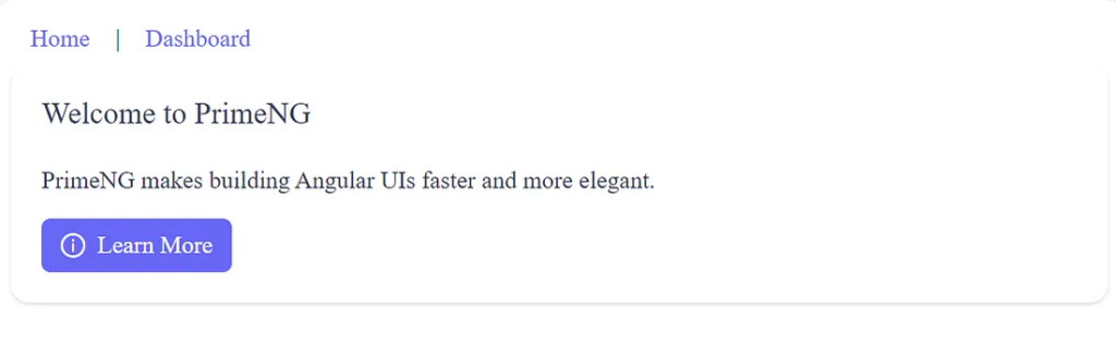
<p-card header="Welcome to PrimeNG">
  <p>PrimeNG makes building Angular UIs faster and more elegant.</p>
  <button pButton type="button" label="Learn More" icon="pi pi-info-circle"></button>
</p-card>
Step 2: Define the Route for the New Page
You need to tell the Angular Router what URL path should load your new component. In a modern standalone application, this is configured in your main routes file, typically src/app/app.routes.ts.
Open src/app/app.routes.ts
import { Routes } from '@angular/router';
import { App } from './app';
import { Dashboard } from './dashboard/dashboard';

export const routes: Routes = [
  {
    path: 'dashboard', component: Dashboard
  },
  { path: '**', redirectTo: '' }
];
Step 3: Add a Navigation Link (Optional)
Finally, you need a way for the user to navigate to your new page. This is done using the routerLink directive in your main application template (e.g., app.component.html or a navigation bar component).
In your app.html file:
<nav>
  <a href="/" target="_blank">
    <p-button label="Home" link />
  </a> |
  <a href="/dashboard" target="_blank">
    <p-button label="Dashboard" link />
  </a>
</nav>

<main>
  <router-outlet></router-outlet>
</main>
In your app.ts file:
import { Component, signal } from '@angular/core';
import { RouterOutlet } from '@angular/router';
import { ButtonModule } from 'primeng/button';

@Component({
  selector: 'app-root',
  imports: [RouterOutlet, ButtonModule],
  templateUrl: './app.html',
  styleUrl: './app.css'
})
export class App {
  protected readonly title = signal('primeng-demo');
}
Launch an application
ng serve
Finally
You started with nothing but determination. Now, you have a dynamic Angular app enhanced by PrimeNG’s elegance. Each step empowered you to build faster, smarter, and with more confidence.
Angular gave structure. PrimeNG added beauty. Together, they form a dream toolkit for modern developers.
Keep exploring PrimeNG components. Add charts, dialogs, and dashboards. Experiment with themes. Each project will make you a better, more creative developer.
Remember — every professional once built their first app. You’ve just built yours. The next one will be even better.
Your journey doesn’t end here. It begins here — with Angular, PrimeNG, and you.
This article was originally published on Medium.