Styling your web application is more than just aesthetics — it boosts usability and brand consistency. If you’re using Next.js, you have several efficient ways to incorporate CSS. Next.js supports multiple styling options, from traditional CSS files to CSS-in-JS libraries.
CSS Directory Structure
/app
│
├── /styles
│   ├── /base
│   │   ├── _reset.css         # CSS Reset (e.g. Normalize or your own)
│   │   ├── _typography.css    # Global font styles and headings
│   │   └── _variables.css     # Custom properties (colors, spacing, etc.)
│   │
│   ├── /components
│   │   ├── button.module.css  # Scoped styles for Button component
│   │   └── card.module.css    # Scoped styles for Card component
│   │
│   ├── /layouts
│   │   └── header.module.css  # Layout-specific modules
│   │
│   ├── /utilities
│   │   ├── _helpers.css       # Helper classes like `.text-center`
│   │   └── _responsive.css    # Media queries or responsive utilities
│   │
│   ├── globals.css            # Global entry point — imports all base files
│   └── tailwind.css           # (Optional) If using Tailwind separately
CSS Directory Structure for Next.js App Router
/app
├── layout.js
├── page.js
├── /styles
│   ├── globals.css           # Entry point for global styles
│   ├── variables.css         # CSS custom properties (colors, fonts, spacing)
│   ├── reset.css             # Normalize or CSS reset
│   ├── typography.css        # Base typography styles
│   ├── utilities.css         # Helper classes (text-center, margin-top, etc.)
│   ├── responsive.css        # Media queries for breakpoints
│   └── index.css             # Optional: Combines base + utilities for 1 import
│
├── /components
│   ├── Button.jsx
│   ├── Button.module.css     # Scoped styles for Button component
│   ├── Navbar.jsx
│   └── Navbar.module.css     # Scoped styles for Navbar component
│
├── /sections
│   ├── Hero.jsx
│   └── Hero.module.css       # Scoped styles for Hero section
1. Using Global CSS
First, let’s start simple. Global CSS files work across your entire application. You can define them in a single file and import them in _app.js.
Steps to follow:
- Create a CSS file, for example:
styles/globals.css. - Add your global styles there.
- In
pages/_app.js, import the CSS:
import '../styles/globals.css'
Important: You can only import global CSS files in pages/_app.js. If you try to import them elsewhere, you’ll see an error.
This method is excellent for resetting styles, defining variables, or adding general layout rules.
Using Global CSS in App Router
When you’re using the App Router, global CSS should be imported in the layout.js or layout.tsx file in your app directory. This is the right place because layout.js wraps your entire application.
1. Create Your Global CSS File
Make a file like this:
/app/globals.css
Add your styles:
/* globals.css */
body {
  margin: 0;
  font-family: 'Inter', sans-serif;
  background: #f8f9fa;
}
2. Import Global CSS in layout.js
Now, go to:
/app/layout.js
Import the CSS file at the top level:
// layout.js
import './globals.css'

export const metadata = {
  title: 'My App',
  description: 'Using global CSS in Next.js App Router',
}

export default function RootLayout({ children }) {
  return (
    <html lang="en">
      <body>{children}</body>
    </html>
  )
}
Important Notes
- You cannot import global CSS files inside components or pages with the App Router.
- Import global styles only once — ideally in the root layout file.
- Don’t forget to restart the dev server if you add the CSS file for the first time.
2. Using CSS Modules
Need scoped styles? CSS Modules are the way to go. They ensure your class names don’t clash across components.
How it works:
- Create a CSS file ending in
.module.css. For example:Button.module.css. - Import and use it inside your component.
2. Using CSS Modules
Need scoped styles? CSS Modules are the way to go. They ensure your class names don’t clash across components.

How it works:
Create a CSS file ending in .module.css. For example: Button.module.css.

Import and use it inside your component.
// Button.js
import styles from './Button.module.css'

export default function Button() {
  return <button className={styles.button}>Click Me</button>
}
CSS Modules automatically scope styles, making them ideal for reusable components.
3. Styled JSX (Built-in Support)
Next.js comes with built-in support for styled-jsx, a CSS-in-JS solution. It allows you to write scoped CSS directly within your components.
Example:
export default function Card() {
  return (
    <div>
      <p>This is a card.</p>
      <style jsx>{`
        div {
          padding: 10px;
          background-color: #f0f0f0;
        }
        p {
          color: #333;
        }
      `}</style>
    </div>
  )
}
Pros: No extra libraries needed.
Cons: The syntax can become bulky in significant components.
4. Tailwind CSS
If you prefer utility-first CSS, Tailwind CSS is a modern choice. It works excellently with Next.js.
Installation:
npm install -D tailwindcss postcss autoprefixer
npx tailwindcss init -p
Update tailwind.config.js and import Tailwind in your global CSS:
/* globals.css */
@tailwind base;
@tailwind components;
@tailwind utilities;
Tailwind makes it easy to build responsive, clean UIs fast. It’s also highly customizable.
5. Sass and SCSS
If you love nesting and variables, Next.js supports Sass out of the box.
Install Sass:
npm install sass
Now, you can create .scss or .sass files and use them like regular CSS Modules:
// styles.module.scss
.card {
  background: $bg-color;
}
Don’t forget to define your variables and mixins. SCSS is ideal for larger projects where CSS organization matters.
SCSS Directory Structure for Both pages and app Routes
/styles
  ├── abstracts/       # Variables, mixins, functions (global helpers)
  │      ├── _variables.scss
  │      ├── _mixins.scss
  │      └── _functions.scss
  │
  ├── base/            # Global styles, resets, typography
  │      ├── _reset.scss
  │      ├── _typography.scss
  │      └── _globals.scss  # e.g. body, html styles
  │
  ├── components/      # Styles for reusable UI components (buttons, cards, modals)
  │      ├── _button.scss
  │      ├── _card.scss
  │      └── _modal.scss
  │
  ├── layouts/         # Layout styles (header, footer, nav)
  │      ├── _header.scss
  │      ├── _footer.scss
  │      └── _sidebar.scss
  │
  ├── pages/           # Page-specific styles for `pages/` directory routes
  │      ├── home.scss
  │      ├── about.scss
  │      └── contact.scss
  │
  ├── app/             # Styles for `app/` directory routes (new Next.js 13+)
  │      ├── layout.scss
  │      ├── page.scss
  │      └── dashboard.scss
  │
  ├── themes/          # Optional, if you want theme support
  │      ├── _light.scss
  │      └── _dark.scss
  │
  └── main.scss        # Main entry SCSS file importing everything
6. Styled Components
Need JavaScript-powered styles? Styled-components is a powerful CSS-in-JS library. It gives you dynamic styling and theming.
Setup:
npm install styled-components
npm install --save-dev babel-plugin-styled-components
Update your Babel config to include the plugin.
Usage:
import styled from 'styled-components'

const Title = styled.h1`
  color: palevioletred;
  font-size: 2rem;
`

export default function Home() {
  return <Title>Hello Styled Components</Title>
}
It’s excellent for dynamic theming and cleaner JSX.
7. Emotion
Emotion is another fast CSS-in-JS library. It offers both styled and css props usage.
Install:
npm install @emotion/react @emotion/styled
Use it like this:
/** @jsxImportSource @emotion/react */
import styled from '@emotion/styled'
import { css } from '@emotion/react'

const Button = styled.button`
  color: hotpink;
`

const style = css`
  font-size: 20px;
`

export default function Example() {
  return <Button css={style}>Emotion Button</Button>
}
Emotion gives you flexibility. Use the css prop for one-off styles or styled components for reusability.
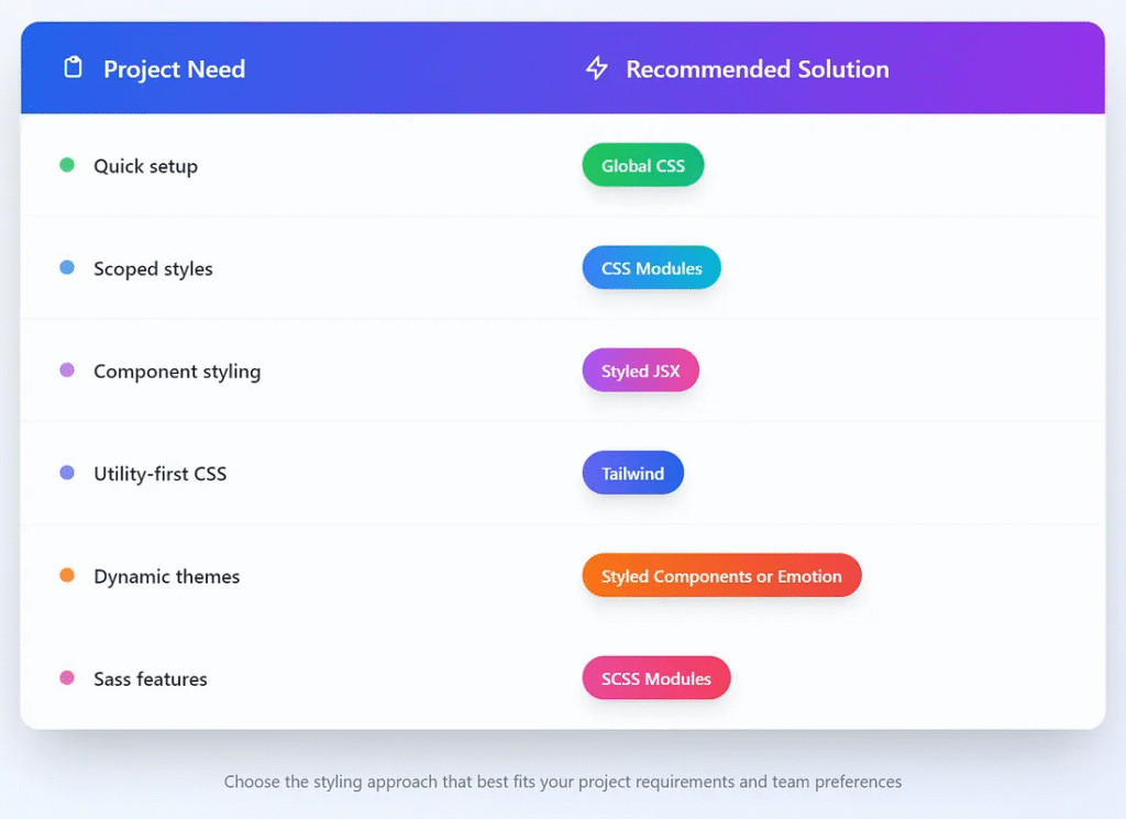
Which One Should You Use?
Final Tips
- Keep your CSS close to your components. It improves maintainability.
- Use variables (CSS or SCSS) for colors and spacing.
- Avoid global styles unless necessary.
- Leverage the
_app.jsfile for root-level layout and style setup. - Consider purging unused styles for performance. Tailwind does this automatically.
Conclusion
Next.js makes styling flexible. Whether you love writing vanilla CSS or prefer modern CSS-in-JS tools, there’s a method for you. Start with one that fits your comfort level. Then, as your project grows, switch to more scalable options.
This article was originally published on Medium.