
If you’ve ever built an e-commerce page with Next.js, you’ve probably asked yourself: “How do I neatly organize product info without overwhelming the user?”
That’s where dynamic tabs come in! Let’s create clean, clickable sections for Description, Specifications, Reviews, and Policies — all using @heroui/react. It’s easy, responsive, and looks super polished.
Why Tabs? Because UX Matters
Think of Amazon. When you click on a product, everything’s neatly categorized. You don’t scroll endlessly. Instead, you tap between tabs. That’s what we’re doing today — giving your users a clean way to navigate product info without getting lost.
Tabs are great for SEO, too. Since everything’s loaded on the same page (and not hidden via navigation), Google crawlers can still index your content. No funky JavaScript hacks needed.
And using @heroui/react makes the process buttery smooth. This library is built with accessibility in mind. Additionally, it works beautifully with Tailwind CSS.
Set up Project

Directory structure
nextjs-app-template/
├── app/
│   ├── product/
│   │   └── [id]/
│   │       └── page.tsx
│   ├── layout.tsx       # Root layout for your application
│   ├── page.tsx         # Home page
│   └── ...              # Other route files
├── public/
│   ├── favicon.ico
│   ├── data.json
│   └── ...              # Other static assets
├── styles/
│   └── global.css       # Global styles
├── package.json
├── tsconfig.json
├── components/
│   └── tabs/
│       └── ProductTabs.tsx
├── types
│   └── ProductType.ts
└── ...
Step 1: Create the Product Detail Page Layout
Start by creating a product detail page component.
Inside your app directory, make a file like product/[id]/page.tsx.
Here’s a simple way to get started:
"use client";

import ProductTabs from "@/components/tabs/ProductTabs";
import { useParams } from "next/navigation";
import { Product } from "@/types/ProductType";
import { useEffect, useState } from "react";
import { Skeleton } from "@heroui/react";

interface ProductDetailParams {
  id: string;
  [key: string]: string;
}

export default function ProductDetailPage() {
  const [loading, setLoading] = useState<boolean>(true);
  const [product, setProduct] = useState<Product | undefined>();

  useEffect(() => {
    const fetchProducts = async () => {
      try {
        setLoading(true);
        const response = await fetch("/data.json");
        if (!response.ok) {
          throw new Error(`HTTP error! status: ${response.status}`);
        }
        const data: Product[] = await response.json();
        const product: Product | undefined = data.find((p) => p.id === id);
        setProduct(product);
      } catch (e: any) {
        console.error("Failed to fetch products:", e);
      } finally {
        setTimeout(() => setLoading(false), 2000);
      }
    };

    fetchProducts();
  }, []);

  const { id } = useParams<ProductDetailParams>();

  if (loading) {
    return (
      <div className="max-w-4xl mx-auto py-20 px-4 text-center text-xl font-semibold">
        <div className="space-y-3">
          <Skeleton className="w-3/5 rounded-lg">
            <div className="h-3 w-3/5 rounded-lg bg-default-200" />
          </Skeleton>
          <Skeleton className="w-4/5 rounded-lg">
            <div className="h-3 w-4/5 rounded-lg bg-default-200" />
          </Skeleton>
          <Skeleton className="w-2/5 rounded-lg">
            <div className="h-3 w-2/5 rounded-lg bg-default-300" />
          </Skeleton>
        </div>
      </div>
    );
  }

  if (!product) {
    return (
      <div className="max-w-4xl mx-auto py-20 px-4 text-center text-xl font-semibold">
        <h1 className="text-3xl font-bold mb-4">Product Not Found</h1>
        <p>
          We couldn't find the product you're looking for. Please check the URL
          or browse our other items.
        </p>
      </div>
    );
  }
  return (
    <div className="max-w-4xl mx-auto py-10 px-4">
      <ProductTabs product={product} />
    </div>
  );
}
Keep the structure clean. We’ll plug in the tabs next.
Step 2: Import and Set Up Tabs from @heroui/react
Now let’s import the Tab component and set up the layout.
import { Tabs } from '@heroui/react'Create the component like this:
//components/tabs/ProductTabs.tsx
"use client";

import React from "react";
import { Card, CardBody, Tab, Tabs } from "@heroui/react";
import { Product } from "@/types/ProductType";

import { StarIcon } from "@heroicons/react/24/solid";
import { StarIcon as OutlineStarIcon } from "@heroicons/react/24/outline";

interface ProductTabsDisplayProps {
  product: Product;
}

type ProductDetailTabKey =
  | "description"
  | "specifications"
  | "reviews"
  | "policies";

interface ProductDetailTab {
  id: ProductDetailTabKey;
  label: string;
}

const ProductTabsDisplay: React.FC<ProductTabsDisplayProps> = ({ product }) => {

  const productDetailTabs: ProductDetailTab[] = [
    { id: "description", label: "Description" },
    { id: "specifications", label: "Specifications" },
    { id: "reviews", label: "Reviews" },
    { id: "policies", label: "Policies" },
  ];

  const renderTabContent = (tabId: ProductDetailTabKey) => {
    switch (tabId) {
      case "description":
        return (
          <p className="text-gray-700 text-base leading-relaxed">
            {product.description}
          </p>
        );
      case "specifications":
        return (
          <ul className="list-disc list-inside space-y-2">
            {product.specifications.map((spec, index) => (
              <li key={index} className="text-gray-700">
                <span className="font-semibold">{spec.label}:</span>{" "}
                {spec.value}
              </li>
            ))}
          </ul>
        );
      case "reviews":
        return (
          <div className="space-y-4">
            {product.reviews.map((review, index) => (
              <div key={index} className="border-b pb-4 last:border-b-0">
                <p className="font-semibold text-gray-800">{review.name}</p>
                <div className="flex items-center mb-1">
                  {Array.from({ length: 5 }).map((_, i) => (
                    <React.Fragment key={i}>
                      {i < review.rating ? (
                        <StarIcon className="w-4 h-4 text-yellow-400" /> // Filled star
                      ) : (
                        <OutlineStarIcon className="w-4 h-4 text-gray-300" /> // Outline star
                      )}
                    </React.Fragment>
                  ))}
                </div>
                <p className="text-gray-700 italic">"{review.text}"</p>
              </div>
            ))}
            {product.reviews.length === 0 && (
              <p className="text-gray-500">No reviews yet.</p>
            )}
          </div>
        );
      case "policies":
        return (
          <p className="text-gray-700 text-base leading-relaxed">
            {product.policies}
          </p>
        );
      default:
        return null;
    }
  };

  return (
    <div className="container mx-auto p-4 sm:p-6 lg:p-8 max-w-4xl">
      <h2 className="text-3xl sm:text-4xl font-extrabold text-gray-900 mb-8 text-center">
        {product.name}
      </h2>
      <Tabs
        aria-label="Product Details"
        items={productDetailTabs}
        variant="bordered"
        color="secondary"
        className="rounded-lg shadow-md"
      >
        {(item: ProductDetailTab) => (
          <Tab key={item.id} title={item.label}>
            <Card className="mt-4 bg-white rounded-lg shadow-xl p-6">
              <CardBody>{renderTabContent(item.id)}</CardBody>
            </Card>
          </Tab>
        )}
      </Tabs>
    </div>
  );
};

export default ProductTabsDisplay;
You can now import <ProductTabs /> into your main product detail page.
Step 3: Add Real Content Dynamically
Eventually, you won’t want to hard-code this content. You’ll probably be fetching it from your backend or a CMS.
Here’s how to simulate that:
//public/data.json
[
{
"id": "prod_001",
"name": "Organic Cotton Hoodie",
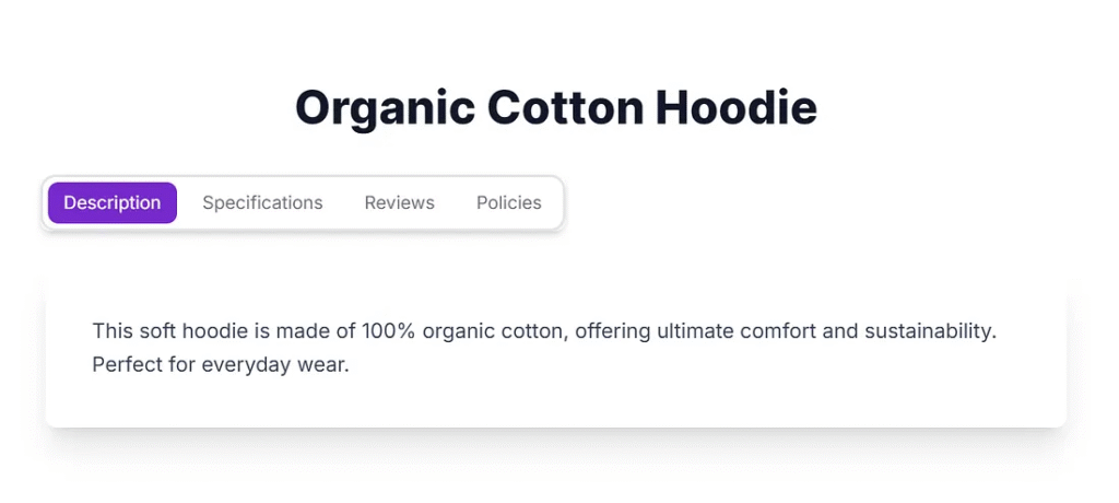
"description": "This soft hoodie is made of 100% organic cotton, offering ultimate comfort and sustainability. Perfect for everyday wear.",
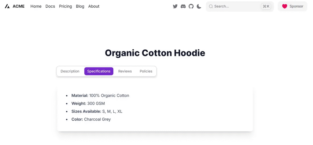
"specifications": [
{
"label": "Material",
"value": "100% Organic Cotton"
},
{
"label": "Weight",
"value": "300 GSM"
},
{
"label": "Sizes Available",
"value": "S, M, L, XL"
},
{
"label": "Color",
"value": "Charcoal Grey"
}
],
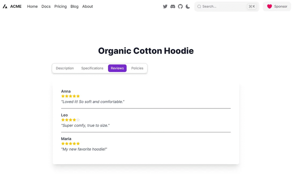
"reviews": [
{
"name": "Anna",
"text": "Loved it! So soft and comfortable.",
"rating": 5
},
{
"name": "Leo",
"text": "Super comfy, true to size.",
"rating": 4
},
{
"name": "Maria",
"text": "My new favorite hoodie!",
"rating": 5
}
],
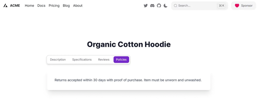
"policies": "Returns accepted within 30 days with proof of purchase. Item must be unworn and unwashed."
},
{
"id": "prod_002",
"name": "Smart Wireless Earbuds",
"description": "Experience crystal-clear audio with these smart wireless earbuds. Featuring active noise cancellation and a long-lasting battery.",
"specifications": [
{
"label": "Connectivity",
"value": "Bluetooth 5.2"
},
{
"label": "Battery Life",
"value": "8 hours (earbuds), 24 hours (with case)"
},
{
"label": "Features",
"value": "Active Noise Cancellation, Touch Controls"
},
{
"label": "Color",
"value": "Midnight Black"
}
],
"reviews": [
{
"name": "Chris",
"text": "Amazing sound quality and great ANC!",
"rating": 5
},
{
"name": "Sophia",
"text": "Comfortable fit, perfect for my commute.",
"rating": 4
},
{
"name": "Daniel",
"text": "Battery life is excellent.",
"rating": 5
}
],
"policies": "1-year limited warranty. Returns accepted within 15 days if unopened."
},
{
"id": "prod_003",
"name": "Ergonomic Office Chair",
"description": "Designed for ultimate comfort during long work hours, this ergonomic chair provides excellent lumbar support and adjustable features.",
"specifications": [
{
"label": "Material",
"value": "Breathable Mesh, Aluminum Base"
},
{
"label": "Adjustments",
"value": "Height, Lumbar Support, Armrests"
},
{
"label": "Max Weight",
"value": "150 kg"
},
{
"label": "Color",
"value": "Graphite"
}
],
"reviews": [
{
"name": "Olivia",
"text": "Transformed my home office. No more back pain!",
"rating": 5
},
{
"name": "Noah",
"text": "A bit pricey but worth every penny.",
"rating": 4
},
{
"name": "Emma",
"text": "Easy to assemble and very sturdy.",
"rating": 5
}
],
"policies": "2-year manufacturer warranty. Free returns within 30 days."
}
]This makes it easier to fetch from an API later on.
Step 4: Create Types
//types/ProductType.ts
export interface Specification {
  label: string;
  value: string;
}

export interface Review {
  name: string;
  text: string;
  rating: number;
}

export interface Product {
  id: string;
  name: string;
  description: string;
  specifications: Specification[];
  reviews: Review[];
  policies: string;
}

export type ProductList = Product[];
Step 5: SEO
Here’s the best part: @heroui/react handles keyboard navigation and ARIA roles automatically. That means users with screen readers can navigate the content using the tab key.
To boost SEO:
- Don’t hide essential text in modals or client-only components.
- Keep all tab content in the DOM. Don’t fetch it lazily unless necessary.
That keeps Google (and your users) happy!
Test Application
1. Access the website with the available product ID.
http://localhost:3000/product/prod_001
2. Click on the Specifications Tab
3. Click on the Reviews Tab
4. Click on Policies Tab
5. Access the website with an unavailable product ID.
http://localhost:3000/product/prod_008
Finally
So there you have it — a slick way to show off your product info using Next.js and @heroui/react. Clean layout, great UX, SEO-friendly, and scalable.
Use this pattern across your entire product catalog. Later, you can plug it into your CMS or GraphQL endpoint. It’s modular and reusable.
If you want to go the extra mile, try:
- Persisting selected tabs in the URL using query params
- Adding icons to each tab label
- Using Framer Motion for smooth transition.
Dynamic Product Tabs Implementation
Next.js Component Flow for organizing product details (Description, Specs, Reviews, Policies) using HeroUI.
1. Dynamic Routing & Fetching
Implement Next.js dynamic routing (`/product/[id]`). Fetch product data (e.g., from `data.json`) based on the URL parameter. Use HeroUI’s `Skeleton` for a smooth loading state.
2. Modular Tabs Component
Create a dedicated `
3. Conditional Content Display
Use a `switch` statement within the tab content renderer. This allows precise control over which content (e.g., `
4. Accessibility & SEO
HeroUI handles keyboard navigation and ARIA roles for free. For SEO, ensure all tab content is rendered in the DOM (not lazy-loaded) so search engines can index the full product page.
This article was originally published on Medium.


This is a great example of turning a product detail page into a tabbed masterpiece! The humor comes from imagining the backend API whining about fetching all that data, while the frontend just sits there calmly using `setTimeout` to pretend its loading. The star icons are probably arguing over who gets filled. Overall, a well-structured, slightly over-the-top guide to making things look fancy!