Managing tasks visually increases productivity. Kanban boards make it easy to track progress and maintain focus. In this tutorial, we’ll build a lightweight Kanban-style task management app using Angular and PrimeNG. You’ll learn to use PrimeNG’s DragDrop, Card, and Dialog components to create an elegant workflow that persists in local storage.
Setting Up the Project

Designing the Application Structure
A clear structure helps maintain scalability. Create folders for components, models, and services:
src/app/
│
├── components/
│   ├── board/
│   │   ├── board.ts
│   │   ├── board.html
│   │   ├── board.spec.ts
│   │   └── board.css
│
├── services/
│   └── task.service.ts
│
└── models/
    └── task.model.ts
Each column will represent a task state: To Do, In Progress, and Done. Tasks will be moved between columns using drag-and-drop.
>ng generate component board
Creating the Task Model
Define a model to represent a task.
export interface Task {
  id: number;
  title: string;
  description: string;
  status: 'todo' | 'inprogress' | 'done';
}
Keep the model minimal but flexible. You can extend it later with fields like priority or due dates.
Implementing Local Storage Persistence
Tasks should persist even after refreshing the browser. Create a service to handle storage logic.
import { Injectable, Inject, PLATFORM_ID } from '@angular/core';
import { isPlatformBrowser } from '@angular/common';
import { Task } from '../models/task.model';

@Injectable({ providedIn: 'root' })
export class TaskService {
  private storageKey = 'kanbanTasks';
  private isBrowser: boolean;

  // 1. Inject PLATFORM_ID to determine the execution environment
  constructor(@Inject(PLATFORM_ID) private platformId: Object) {
    this.isBrowser = isPlatformBrowser(this.platformId);
  }

  getTasks(): Task[] {
    // 2. Wrap localStorage access in an environment check
    if (this.isBrowser) {
      const data = localStorage.getItem(this.storageKey);
      return data ? JSON.parse(data) : [];
    }
    // Return an empty array or a default state if running on the server
    return [];
  }

  saveTasks(tasks: Task[]): void {
    // 3. Wrap localStorage access in an environment check
    if (this.isBrowser) {
      localStorage.setItem(this.storageKey, JSON.stringify(tasks));
    }
  }
}
This service provides a simple persistence layer that ensures data survives between sessions.
Building the Board Component
Create the Kanban board component that will hold the task columns.
import { Component, OnInit } from '@angular/core';
import { TaskService } from '../../services/task.service';
import { Task } from '../../models/task.model';

import { FormsModule } from '@angular/forms';
import { CardModule } from 'primeng/card';
import { DialogModule } from 'primeng/dialog';
import { ButtonModule } from 'primeng/button';
import { InputTextModule } from 'primeng/inputtext';
import { TextareaModule } from 'primeng/textarea';
import { DragDropModule } from 'primeng/dragdrop';
import { CommonModule } from '@angular/common';

@Component({
  standalone: true,
  selector: 'app-board',
  templateUrl: './board.html',
  styleUrls: ['./board.css'],
  imports: [
    FormsModule,
    CardModule,
    DialogModule,
    ButtonModule,
    InputTextModule,
    TextareaModule,
    DragDropModule,
    CommonModule,
  ],
})
export class BoardComponent implements OnInit {
  tasks: Task[] = [];
  todo: Task[] = [];
  inprogress: Task[] = [];
  done: Task[] = [];
  displayDialog = false;
  selectedTask: Task | null = null;

  constructor(private taskService: TaskService) {}

  ngOnInit() {
    this.tasks = this.taskService.getTasks();
    this.refreshColumns();
  }

  refreshColumns() {
    this.todo = this.tasks.filter((t) => t.status === 'todo');
    this.inprogress = this.tasks.filter((t) => t.status === 'inprogress');
    this.done = this.tasks.filter((t) => t.status === 'done');
  }

  dragStart(task: any) {
    this.selectedTask = task;
  }

  dragEnd() {
    this.selectedTask = null;
  }

  onDrop(event: any, targetColumn: string) {
    console.log('onDrop');
    if (!this.selectedTask) return;

    // Remove from all arrays
    this.todo = this.todo.filter((t) => t.id !== this.selectedTask?.id);
    this.inprogress = this.inprogress.filter((t) => t.id !== this.selectedTask?.id);
    this.done = this.done.filter((t) => t.id !== this.selectedTask?.id);

    // Add to target array
    if (targetColumn === 'todo') {
      this.todo.push(this.selectedTask);
    } else if (targetColumn === 'inprogress') {
      this.inprogress.push(this.selectedTask);
    } else {
      this.done.push(this.selectedTask);
    }

    this.selectedTask = null;
  }

  onTitleChange(value: string) {
    if (this.selectedTask) {
      this.selectedTask.title = value;
    }
  }

  onDescriptionChange(value: string) {
    if (this.selectedTask) {
      this.selectedTask.description = value;
    }
  }

  openDialog(task?: Task) {
    this.selectedTask = task
      ? { ...task }
      : { id: Date.now(), title: '', description: '', status: 'todo' };
    this.displayDialog = true;
  }

  saveTask() {
    const existing = this.tasks.find((t) => t.id === this.selectedTask!.id);
    if (existing) {
      Object.assign(existing, this.selectedTask);
    } else {
      this.tasks.push(this.selectedTask!);
    }
    this.taskService.saveTasks(this.tasks);
    this.refreshColumns();
    this.displayDialog = false;
  }

}
This component manages state, displays tasks, and handles persistence. Tasks are dynamically grouped by status.
Adding the Board Template
Define the structure and design in board.html.
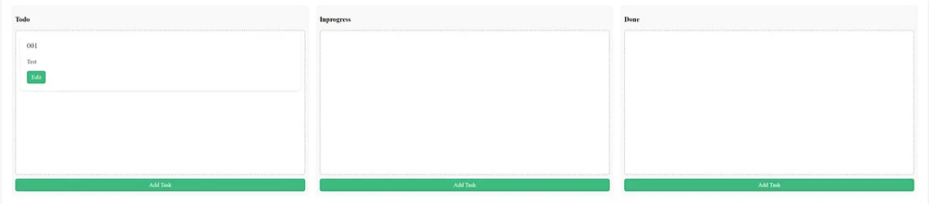
<div class="kanban-container">
<div class="kanban-column" *ngFor="let column of ['todo', 'inprogress', 'done']">
<h3>{{ column | titlecase }}</h3>
<div pDroppable="tasks" (onDrop)="onDrop($event, column)" class="drop-zone">
@for (task of (column === 'todo' ? todo : column === 'inprogress' ? inprogress : done); track
task.id) {
<div pDraggable="tasks" (onDragStart)="dragStart(task)" (onDragEnd)="dragEnd()">
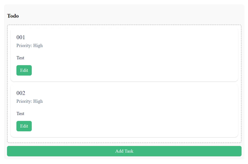
<p-card [header]="task?.title || 'Untitled'" subheader="Priority: High">
<p>{{ task?.description || 'No description' }}</p>
<ng-template #footer>
<div class="flex gap-2 mt-1">
<button pButton label="Edit" (click)="openDialog(task)"></button>
</div>
</ng-template>
</p-card>
</div>
}
</div>
<button pButton label="Add Task" (click)="openDialog()" class="add-btn"></button>
</div>
</div>
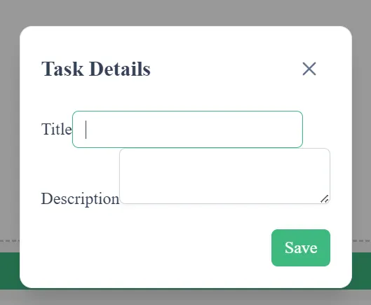
<p-dialog [(visible)]="displayDialog" header="Task Details" [modal]="true">
<div class="p-fluid">
<div class="field">
<label for="title">Title</label>
<input
id="title"
type="text"
pInputText
[ngModel]="selectedTask?.title"
(ngModelChange)="onTitleChange($event)"
/>
</div>
<div class="field">
<label for="desc">Description</label>
<textarea
id="desc"
pInputTextarea
[ngModel]="selectedTask?.description"
(ngModelChange)="onDescriptionChange($event)"
></textarea>
</div>
</div>
<ng-template #footer>
<button pButton label="Save" (click)="saveTask()"></button>
</ng-template>
</p-dialog>PrimeNG’s p-card and p-dialog provide responsive, elegant interfaces with minimal effort.
The drag-and-drop interactions are intuitive, powered by the DragDropModule.
7. Styling the Kanban Board
Add styling in board.css to create a clean layout.
.kanban-container {
  display: flex;
  justify-content: space-between;
  gap: 20px;
  padding: 20px;
}

.kanban-column {
  flex: 1;
  background: #f9f9f9;
  border-radius: 8px;
  padding: 10px;
  min-height: 500px;
}

.drop-zone {
  min-height: 400px;
  padding: 10px;
  background: #fff;
  border: 2px dashed #ccc;
  border-radius: 6px;
}

.add-btn {
  width: 100%;
  margin-top: 10px;
}
A well-structured design enhances usability. The layout should be responsive and accessible.
8. Enabling PrimeNG Modules
Add the necessary modules in board.ts.
import { Component, OnInit } from '@angular/core';
import { TaskService } from '../../services/task.service';
import { Task } from '../../models/task.model';

import { FormsModule } from '@angular/forms';
import { CardModule } from 'primeng/card';
import { DialogModule } from 'primeng/dialog';
import { ButtonModule } from 'primeng/button';
import { InputTextModule } from 'primeng/inputtext';
import { TextareaModule } from 'primeng/textarea';
import { DragDropModule } from 'primeng/dragdrop';
import { CommonModule } from '@angular/common';

@Component({
  standalone: true,
  selector: 'app-board',
  templateUrl: './board.html',
  styleUrls: ['./board.css'],
  imports: [
    FormsModule,
    CardModule,
    DialogModule,
    ButtonModule,
    InputTextModule,
    TextareaModule,
    DragDropModule,
    CommonModule,
  ],
})
export class BoardComponent implements OnInit
...
Ensure all modules are imported to correctly activate PrimeNG features.
9. Testing Drag-and-Drop Functionality
Run the app with:
ng serve
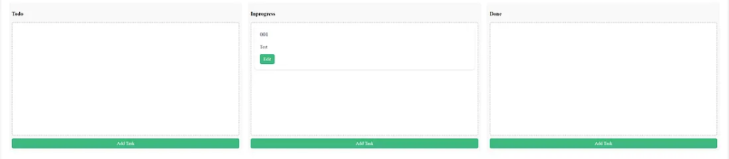
Drag tasks from To Do to In Progress or Done. Each move updates the task’s state and persists it. This seamless behavior enhances user productivity and focus.

Add a task in Todo
Move a task in Todo to In Progress.
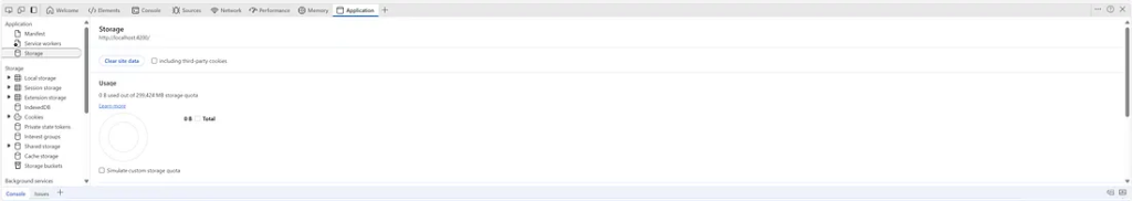
Clear local storage in Developer Tools for the test.
Go to the Application tab, select Storage, then click Clear Site Data.
10. Improving User Experience
Enhance your board with these ideas:
- Add colors per column for quick recognition.
- Include confirmation dialogs for deletions.
- Enable sorting within columns.
- Add a filter to search tasks.
Every improvement increases usability and engagement.
PrimeFlex

Form Layout
<p-dialog [(visible)]="displayDialog" header="Task Details" [modal]="true">
  <div class="p-fluid">
    <div class="field">
      <label for="title">Title</label>
      <input
        id="title"
        type="text"
        pInputText
        [ngModel]="selectedTask?.title"
        (ngModelChange)="onTitleChange($event)"
        class="text-base text-color surface-overlay p-2 border-1 border-solid surface-border border-round appearance-none outline-none focus:border-primary w-full"
      />
    </div>
    <div class="field">
      <label for="desc">Description</label>
      <textarea
        id="desc"
        pInputTextarea
        [ngModel]="selectedTask?.description"
        (ngModelChange)="onDescriptionChange($event)"
        class="text-base text-color surface-overlay p-2 border-1 border-solid surface-border border-round appearance-none outline-none focus:border-primary w-full"
      ></textarea>
    </div>
  </div>
  <ng-template #footer>
    <button pButton label="Save" (click)="saveTask()"></button>
  </ng-template>
</p-dialog>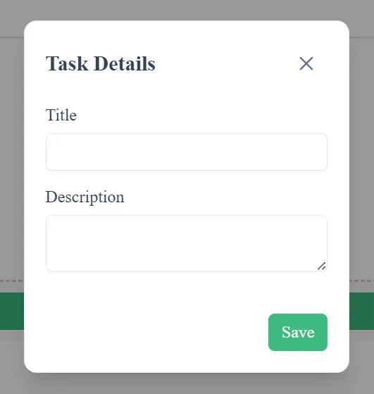
Grid Layout
    <div pDroppable="tasks" (onDrop)="onDrop($event, column)" class="drop-zone">
      @for (task of (column === 'todo' ? todo : column === 'inprogress' ? inprogress : done); track
      task.id) {
      <div class="grid">
        <div class="col">
          <div pDraggable="tasks" (onDragStart)="dragStart(task)" (onDragEnd)="dragEnd()">
            <p-card [header]="task?.title || 'Untitled'">
              <p>{{ task?.description || 'No description' }}</p>
              <button pButton label="Edit" (click)="openDialog(task)"></button>
            </p-card>
          </div>
        </div>
      </div>
      }
    </div>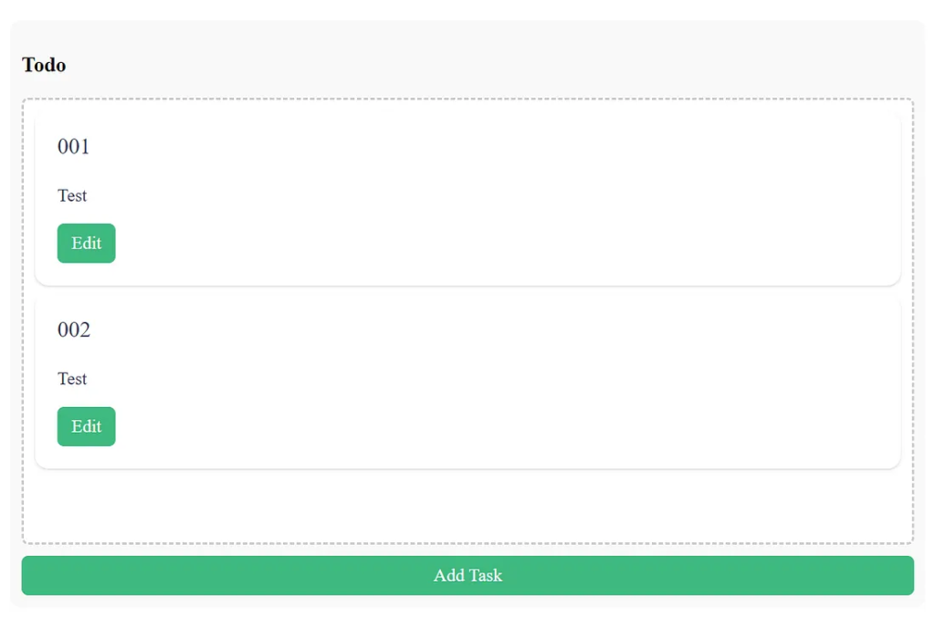
11. Managing Task States
In the current setup, status changes are reflected immediately. You can expand task states to include more granular progress states, such as “Review” or “Blocked.” Update the model and refresh logic easily.
status: 'todo' | 'inprogress' | 'review' | 'done';
Then, extend the template to display the additional state.
12. Handling Data Persistence
Local storage ensures quick and offline-ready functionality. However, for larger projects, integrate a backend API. Use Angular’s HttpClient to connect with RESTful endpoints for scalability.
import { HttpClient } from '@angular/common/http';Even though our app uses local storage, the architecture remains flexible for future enhancements.
13. Using PrimeNG Dialogs Effectively
Dialogs make it easy to add and edit tasks. The p-dialog The component supports animations, dynamic headers, and templates for flexibility.
Keep dialogs accessible by adding ARIA attributes and ensuring focus transitions properly when opening and closing.
14. Optimizing for Performance
PrimeNG components are lightweight but can grow heavy when many tasks are involved. Use Angular’s trackBy for better rendering:
<div *ngFor="let task of todo; trackBy: trackById">
And define the function:
trackById(index: number, task: Task): number {
  return task.id;
}
This optimization reduces DOM re-renders and improves responsiveness.
15. Adding Theming and Branding
PrimeNG supports multiple prebuilt themes. You can switch themes to match your brand identity or user preferences.
npm install primeng/resources/themes/saga-blue/theme.css
Consistency in UI elements strengthens user trust and satisfaction.
16. Extending Functionality with PrimeNG Cards
The p-card component is versatile. You can display tags, due dates, or priority levels within the card.
<p-card header="{{task.title}}" subheader="Priority: High">
  <p>{{task.description}}</p>
</p-card>
This visual hierarchy helps users quickly focus on essential items.
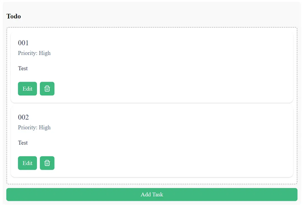
17. Implementing Task Deletion
Add a delete button inside each task card:
<button pButton icon="pi pi-trash" (click)="deleteTask(task)"></button>
And handle it in the component:
deleteTask(task: Task) {
  this.tasks = this.tasks.filter(t => t.id !== task.id);
  this.taskService.saveTasks(this.tasks);
  this.refreshColumns();
}
Now, users can easily clean up old or completed tasks.
18. Final Touches and Summary
You’ve built a functional Kanban-style task manager using Angular 20 and PrimeNG. It supports creating, editing, dragging, and persisting tasks. The UI is clean, fast, and intuitive.
Your board demonstrates:
- Effective use of PrimeNG components.
- Practical drag-and-drop interaction.
- Robust state management.
- Lightweight local persistence.
19. Key Takeaways
PrimeNG DragDropsimplifies visual state transitions.p-cardProvides a structured task representation.p-dialogEnables quick edits without page reloads.Local storageEnsures persistence with minimal overhead.Angular’s architectureKeeps the app maintainable and modular.
20. Next Steps
Expand the app with:
- Cloud synchronization.
- Authentication with JWT.
- Team collaboration boards.
- Push notifications for deadlines.
Each addition transforms this simple project into a full-featured productivity platform.
Finally
You now have a complete, maintainable Kanban board application powered by Angular and PrimeNG. With just a few components — DragDrop, Card, and Dialog — you can craft a productive workflow tool.
By following these steps, you’ve created a solid foundation that balances simplicity, speed, and scalability. Keep refining, and soon, this lightweight app could become your team’s favorite productivity companion.
This article was originally published on Medium.