Growing an audience requires capturing emails effectively. A newsletter signup modal can achieve this while maintaining a modern design. In this tutorial, we’ll create a modal in Next.js using HeroUI (@heroui/react). You’ll also learn how to make it appear automatically and use local storage to avoid showing it repeatedly. Let’s dive in.
Why Build a Newsletter Modal?
A well-placed signup modal helps you convert visitors into subscribers. Many sites use them for updates, offers, or community news. While some popups annoy users, the right timing and design make them effective. HeroUI gives us elegant components for modals, inputs, and buttons. Combined with Next.js, we can create a seamless and fast experience.
Instead of reinventing the wheel, we’ll build with ready-to-use components. HeroUI ensures accessibility and customization, while Next.js provides structure and performance. Adding local storage will help us remember if a user has dismissed the pop-up. This improves the user experience and prevents frustration.
By the end, you’ll have a professional modal that appears once per user. It will display automatically, but won’t reappear after being closed. This simple detail makes the project practical for real websites.
Setting Up the Project

Building the Newsletter Modal
We’ll use the Modal, Input, and Button components from HeroUI. Create a new file NewsletterModal.tsx inside the components folder.
"use client";
import { useEffect, useState } from "react";
import {
Modal,
Input,
Button,
useDisclosure,
ModalContent,
ModalHeader,
ModalBody,
ModalFooter,
} from "@heroui/react";
export default function NewsletterModal() {
const { isOpen, onOpen, onOpenChange } = useDisclosure();
const [email, setEmail] = useState("");
useEffect(() => {
const shown = localStorage.getItem("newsletter-shown");
if (!shown) {
setTimeout(() => {
localStorage.setItem("newsletter-shown", "true");
}, 3000); // popup after 3 seconds
}
}, []);
const handleSubscribe = () => {
console.log("Subscribed:", email);
};
return (
<>
<Button onPress={onOpen} color="primary">Subscribe</Button>
<Modal isOpen={isOpen} onOpenChange={onOpenChange}>
<ModalContent>
{(onClose) => (
<div className="p-6 flex flex-col gap-4">
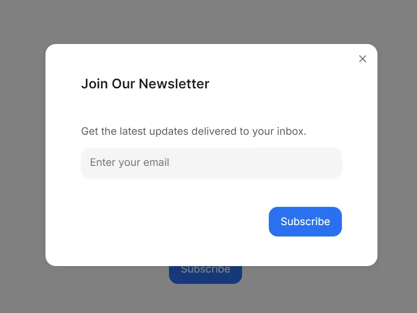
<ModalHeader className="flex flex-col gap-1">
Join Our Newsletter
</ModalHeader>
<ModalBody>
<p className="text-sm text-gray-600">
Get the latest updates delivered to your inbox.
</p>
<Input
placeholder="Enter your email"
value={email}
onChange={(e) => setEmail(e.target.value)}
/>
</ModalBody>
<ModalFooter>
<Button onPress={handleSubscribe} color="primary">Subscribe</Button>
</ModalFooter>
</div>
)}
</ModalContent>
</Modal>
</>
);
}In this component, we use a state variable isOpen to control modal visibility. The useEffect hook checks local storage to see if the pop-up was shown before. If not, it sets a timer and displays the modal after three seconds. Once shown, the flag newsletter-shown is stored to prevent future popups.
The handleSubscribe function closes the modal and logs the email. In a real project, you would send the email to your backend or a service like Mailchimp.
Adding the Modal to Your Page
Next, integrate the modal into your homepage. Open page.tsx inside the app directory. Import the component and render it.
import NewsletterModal from "../../components/newsletter/NewsletterModal";
export default function Home() {
return (
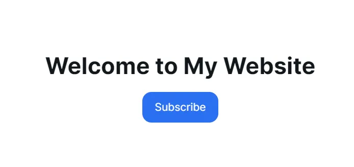
<main className="flex flex-col items-center justify-center min-h-screen p-6">
<h1 className="text-3xl font-bold mb-4">Welcome to My Website</h1>
<NewsletterModal />
</main>
);
}Now, when you visit your homepage, the modal should appear after a short delay. Close it, refresh the page, and you won’t see it again. Local storage ensures the pop-up is shown only once.
This small addition makes your site more engaging while avoiding repeated interruptions. Visitors can easily subscribe, and the modal design appears modern thanks to HeroUI.
Test application
>npm run dev
http://localhost:3000/newsletter
Improving the Design
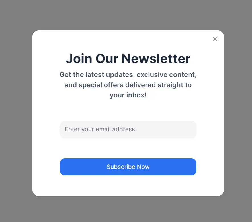
The modal works, but let’s improve its styling. HeroUI lets us add Tailwind classes for customization. Update the modal content with better spacing, colors, and typography.
<>
<Button onPress={onOpen} color="primary">
Subscribe
</Button>
<Modal isOpen={isOpen} onOpenChange={onOpenChange}>
<ModalContent>
{(onClose) => (
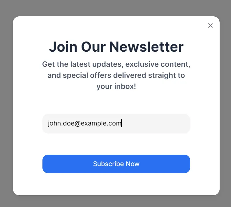
<div className="p-6 sm:p-8 flex flex-col gap-6 items-center text-center">
<ModalHeader className="flex flex-col gap-2">
<h2 className="text-2xl sm:text-3xl font-bold text-gray-800">
Join Our Newsletter
</h2>
<p className="text-base text-gray-600 max-w-sm mx-auto">
Get the latest updates, exclusive content, and special offers
delivered straight to your inbox!
</p>
</ModalHeader>
<ModalBody className="w-full flex flex-col items-center gap-4">
<Input
placeholder="Enter your email address"
value={email}
onChange={(e) => setEmail(e.target.value)}
className="w-full max-w-xs"
/>
</ModalBody>
<ModalFooter className="w-full flex justify-center">
<Button
onPress={handleSubscribe}
color="primary"
className="w-full max-w-xs"
>
Subscribe Now
</Button>
</ModalFooter>
</div>
)}
</ModalContent>
</Modal>
</>This version gives the modal a polished look. Rounded corners, a shadow, and hover effects make it stand out. Users will notice the pop-up but won’t find it intrusive.
You can also adjust the pop-up timing. Right now, it appears after three seconds. Depending on your audience, you may want a longer delay. A later trigger often feels more natural, especially if users spend more time reading.
Handling Submissions
Currently, the handleSubscribe function logs the email. You can replace it with a real API call. For example, you could use a Next.js API route.
Create a file app/api/subscribe/route.ts. Add this code:
// app/api/subscribe/route.ts

export async function POST(request: Request) {
  const { email } = await request.json();
  console.log("New subscription:", email);

  return new Response(JSON.stringify({ message: "Subscription successful" }), {
    status: 200,
    headers: {
      "Content-Type": "application/json",
    },
  });
}
Update handleSubscribe in your modal:
  const handleSubscribe = async () => {
    const response = await fetch("/api/subscribe", {
      method: "POST",
      headers: { "Content-Type": "application/json" },
      body: JSON.stringify({ email }),
    });

    if (response.ok) {
      console.log("Subscribed successfully");
      onClose();
    }
  };
This sends the email to your backend API. From there, you can integrate external services or store it in a database.
New subscription: [email protected]
Handle an error
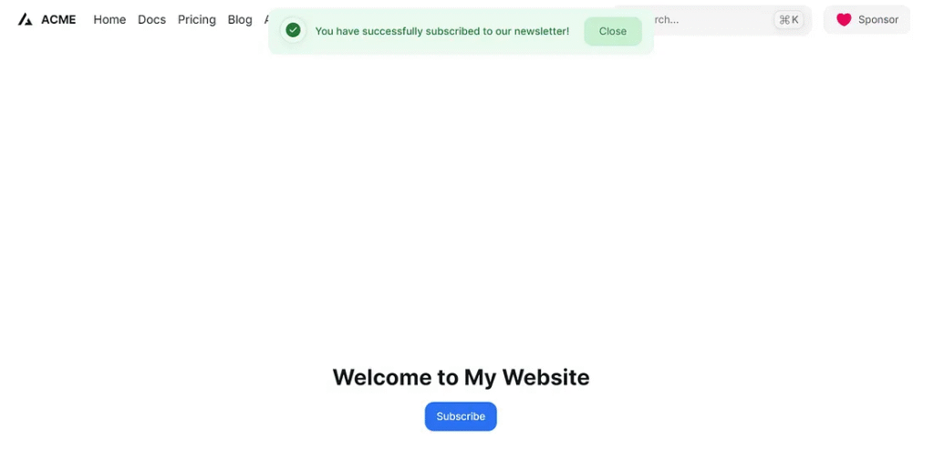
The handleSubscribe function is an asynchronous operation triggered when a user attempts to subscribe.
API Call: It sends a POST request to /api/subscribe the user’s email.
Success Handling: If the response.ok is true (status 200-299), it logs a success message, sets a success alert message and type, and makes the alert visible (setShowAlert(true)), closes the modal (onClose()), and clears the email input.
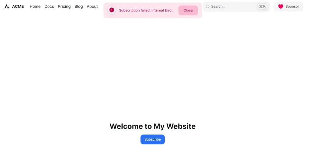
Error Handling (API Response): If the response is not ok (e.g., a 4xx or 5xx status code), It parses the error message from the API, sets a danger (error) alert message and type, makes the alert visible, and also closes the modal.
Error Handling (Network/Other): The catch block handles any network issues or unexpected errors during the fetch operation, setting a generic danger (error) alert message and type, displaying the alert, and closing the modal.
Essentially, this function orchestrates the communication with your backend for subscription, providing immediate visual feedback to the user and managing the UI state accordingly.
const [showAlert, setShowAlert] = useState(false);
const [alertMessage, setAlertMessage] = useState("");
const [alertType, setAlertType] = useState<
  | "default"
  | "primary"
  | "secondary"
  | "success"
  | "warning"
  | "danger"
  | undefined
>(); // 'success' or 'danger'

const handleSubscribe = async () => {
  try {
    const response = await fetch("/api/subscribe", {
      method: "POST",
      headers: {
        "Content-Type": "application/json",
      },
      body: JSON.stringify({ email }),
    });

    if (response.ok) {
      console.log("Subscribed successfully");
      setAlertMessage("You have successfully subscribed to our newsletter!");
      setAlertType("success");
      setShowAlert(true);
      onClose();
      setEmail("");
    } else {
      const errorData = await response.json();
      console.error("Subscription failed:", errorData.message);
      setAlertMessage(
        `Subscription failed: ${errorData.message || "Please try again."}`
      );
      setAlertType("danger");
      setShowAlert(true);
      onClose();
    }
  } catch (error) {
    console.error("Error subscribing:", error);
    setAlertMessage("An unexpected error occurred. Please try again later.");
    setAlertType("danger");
    setShowAlert(true);
    onClose();
  } finally {
    setTimeout(() => setShowAlert(false), 3000);
  }
};
{showAlert && (
<div className={`fixed top-4 right-4 p-4 rounded-md z-50`}>
<Alert
color={alertType}
title={alertMessage}
endContent={
<Button color={alertType} variant="flat" onPress={()=>{setShowAlert(false)}}>
Close
</Button>
}
/>
</div>
)}
Add Frame motion
This code displays a dynamically animated alert notification using Framer Motion and Tailwind CSS. The AnimatePresence component is crucial; it ensures that when showAlert becomes false, the motion.div plays its exit animation (fading out and moving up) before being removed from the DOM. When showAlert is true, the motion.div animates into view (fading in and sliding down). The alert itself is positioned at the top of the screen, horizontally centered, and styled based on alertType (success or danger), showing a message and a close button.
>npm install framer-motion
import { AnimatePresence, motion } from "framer-motion";

<AnimatePresence>
  {showAlert && (
    <div className={`fixed top-4 center-4 rounded-md z-50`}>
      <motion.div
        initial={{ opacity: 0, y: -20 }} // Initial state
        animate={{ opacity: 1, y: 0 }} // Target state
        transition={{ duration: 0.8, ease: "linear", delay: 0.2 }} // Transition properties
        exit={{
          opacity: 0,
          y: -20,
          transition: { duration: 0.5, ease: "easeIn" },
        }} // Fade out and move up when exiting
      >
        <Alert
          color={alertType}
          title={<span className="mr-4">{alertMessage}</span>}
          endContent={
            <Button
              color={alertType}
              size="md"
              variant="flat"
              onPress={() => {
                setShowAlert(false);
              }}
            >
              Close
            </Button>
          }
        />
      </motion.div>
    </div>
  )}
</AnimatePresence>
Finally
You just built a functional newsletter modal in Next.js with HeroUI. It appears automatically, looks professional, and remembers user actions with local storage. You also learned how to extend it with an API endpoint for real subscriptions.
This project shows the power of combining Next.js with HeroUI. You get performance, structure, and a design system that ensures consistency across everything. Adding local storage ensures visitors enjoy a smooth experience without repeated interruptions.
Try experimenting with timing, styling, and submission handling. You could even add animations or discounts for new subscribers. A minor feature like this can significantly improve audience engagement.
Keep building, and your website will feel more interactive and user-friendly.
This article was originally published on Medium.