Dark mode has become a standard feature in modern apps. Users love it for reducing eye strain and saving battery. If you’re using Next.js and want to implement a seamless dark mode toggle, you’re in the right place.
This tutorial shows you how to add light/dark mode to your Next.js app using Tailwind CSS and dynamically swap Heroicons based on the theme. Let’s dive in.

Step 2: Create a Dark Mode Toggle Using React State
We’ll use React state to switch themes. Start by creating a ThemeToggle component.
// components/ThemeToggle.tsx
"use client";
import { useEffect, useState } from "react";

export default function ThemeToggle() {
  const [theme, setTheme] = useState("light");

  useEffect(() => {
    const savedTheme = localStorage.getItem("theme") || "light";

    setTheme(savedTheme);
    document.documentElement.classList.toggle("dark", savedTheme === "dark");
  }, []);

  const toggleTheme = () => {
    const newTheme = theme === "light" ? "dark" : "light";

    setTheme(newTheme);
    document.documentElement.classList.toggle("dark", newTheme === "dark");
    localStorage.setItem("theme", newTheme);
  };

  return (
    <button onClick={toggleTheme}>
      Toggle {theme === "light" ? "🌙" : "☀️"}
    </button>
  );
}
This component initializes the theme from localStorage. When clicked, it toggles the dark class on <html> and updates the storage.
Step 3: Install and Use Heroicons with Theme Awareness
Heroicons provide beautifully designed SVG icons. Install them using:
npm install @heroicons/react
Now, edit the ThemeToggle to include icons that reflect the theme:
import { MoonIcon, SunIcon } from '@heroicons/react/24/solid';

export default function ThemeToggle() {
  const [theme, setTheme] = useState('light');

  useEffect(() => {
    const savedTheme = localStorage.getItem('theme') || 'light';
    setTheme(savedTheme);
    document.documentElement.classList.toggle('dark', savedTheme === 'dark');
  }, []);

  const toggleTheme = () => {
    const newTheme = theme === 'light' ? 'dark' : 'light';
    setTheme(newTheme);
    document.documentElement.classList.toggle('dark', newTheme === 'dark');
    localStorage.setItem('theme', newTheme);
  };

  return (
    <button onClick={toggleTheme} className="p-2 rounded-md bg-gray-200 dark:bg-gray-700">
      {theme === 'light' ? (
        <MoonIcon className="w-6 h-6 text-gray-800" />
      ) : (
        <SunIcon className="w-6 h-6 text-yellow-400" />
      )}
    </button>
  );
}
With this change, the icon visually represents the current theme. The Moon icon suggests dark mode is next, and vice versa.
Step 4: Apply Theme Styles to Your App Layout
Make your entire app responsive to the dark mode. Update the layout or app/page.tsx file:
import '../styles/globals.css';
import ThemeToggle from '../components/ThemeToggle';

function MyApp({ Component, pageProps }) {
  return (
    <div className="min-h-screen bg-white dark:bg-gray-900 text-gray-900 dark:text-gray-100 transition-colors duration-300">
      <header className="flex justify-end p-4">
        <ThemeToggle />
      </header>
      <main className="p-4">
        <Component {...pageProps} />
      </main>
    </div>
  );
}

export default MyApp;
Now, your app layout will automatically switch colors based on the active theme. That includes background and text colors.
Step 5: Dynamically Render Icons Elsewhere Based on Theme
You may want more icons to respond to the current theme. Instead of manually passing the state around, use the useEffect hook and Tailwind’s class management to handle that globally.
Here’s an example component that changes icons depending on the theme:
// app/theme_demo/page.tsx
"use client";
import React, { useEffect, useState } from "react";
import {
SunIcon,
MoonIcon,
HomeIcon,
StarIcon,
BellIcon,
} from "@heroicons/react/24/outline";
// The ThemeAwareIcon component provided by the user
function ThemeAwareIcon() {
const [isDark, setIsDark] = useState(false);
useEffect(() => {
const html = document.documentElement;
setIsDark(html.classList.contains("dark"));
}, []);
useEffect(() => {
const observer = new MutationObserver(() => {
setIsDark(document.documentElement.classList.contains("dark"));
});
observer.observe(document.documentElement, {
attributes: true,
attributeFilter: ["class"],
});
return () => observer.disconnect();
}, []);
return (
<div>
{!isDark ? (
<SunIcon className="w-8 h-8 text-yellow-400" />
) : (
<MoonIcon className="w-8 h-8 text-gray-700" />
)}
</div>
);
}
// Main App component to demonstrate the theme switch
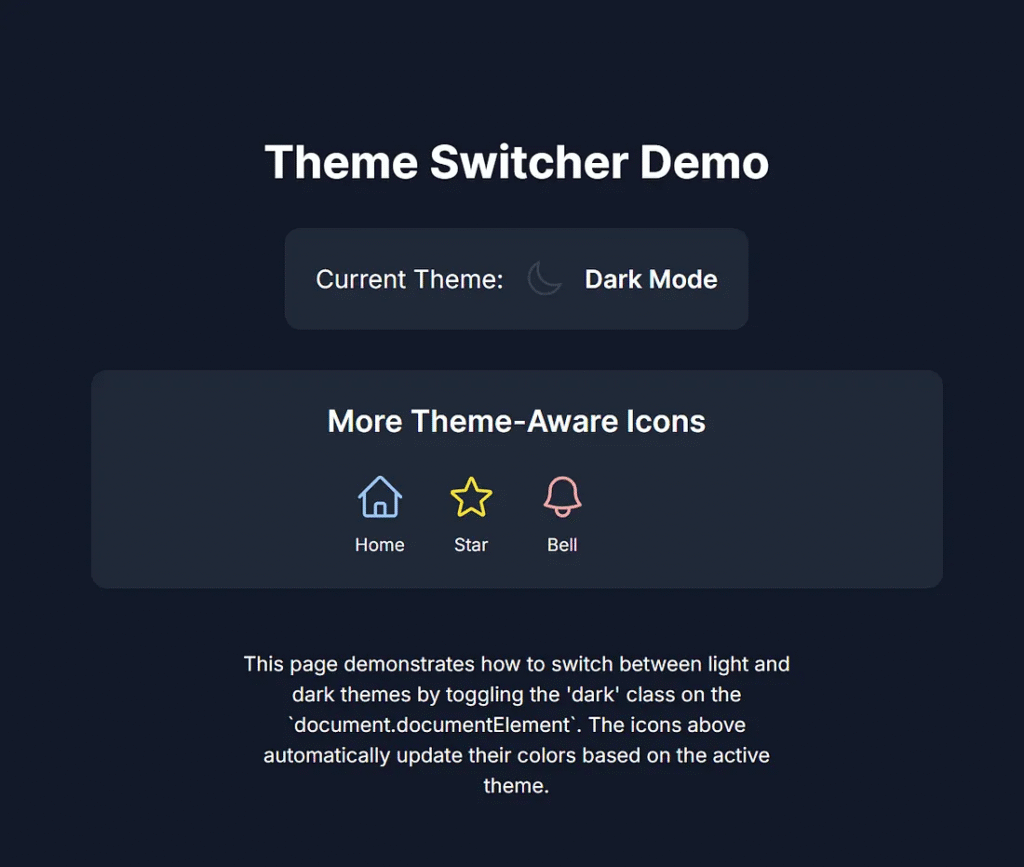
export default function App() {
const [isDark, setIsDark] = useState(false);
useEffect(() => {
const html = document.documentElement;
setIsDark(html.classList.contains("dark"));
}, []);
useEffect(() => {
const observer = new MutationObserver(() => {
setIsDark(document.documentElement.classList.contains("dark"));
});
observer.observe(document.documentElement, {
attributes: true,
attributeFilter: ["class"],
});
return () => observer.disconnect();
}, []);
return (
<div className="min-h-screen flex flex-col items-center justify-center p-4 transition-colors duration-300 bg-white dark:bg-gray-900 text-gray-900 dark:text-white font-inter rounded-lg shadow-lg">
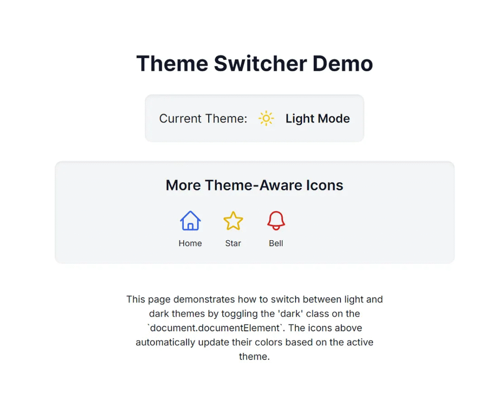
<h1 className="text-4xl font-bold mb-8 text-center">
Theme Switcher Demo
</h1>
<div className="flex items-center space-x-4 mb-8 p-6 bg-gray-100 dark:bg-gray-800 rounded-xl shadow-inner">
<p className="text-xl">Current Theme:</p>
<ThemeAwareIcon />
<span className="text-xl font-semibold">
{isDark ? "Dark Mode" : "Light Mode"}
</span>
</div>
<div className="w-full max-w-2xl p-6 bg-gray-100 dark:bg-gray-800 rounded-xl shadow-inner flex flex-col items-center">
<h2 className="text-2xl font-semibold mb-6">More Theme-Aware Icons</h2>
<div className="grid grid-cols-2 sm:grid-cols-3 md:grid-cols-4 gap-8">
<div className="flex flex-col items-center space-y-2">
<HomeIcon
className={`w-10 h-10 ${isDark ? "text-blue-300" : "text-blue-600"}`}
/>
<span className="text-sm">Home</span>
</div>
<div className="flex flex-col items-center space-y-2">
<StarIcon
className={`w-10 h-10 ${isDark ? "text-yellow-300" : "text-yellow-500"}`}
/>
<span className="text-sm">Star</span>
</div>
<div className="flex flex-col items-center space-y-2">
<BellIcon
className={`w-10 h-10 ${isDark ? "text-red-300" : "text-red-600"}`}
/>
<span className="text-sm">Bell</span>
</div>
{/* You can add more icons here */}
</div>
</div>
<p className="mt-12 text-center max-w-md">
This page demonstrates how to switch between light and dark themes by
toggling the 'dark' class on the `document.documentElement`.
The icons above automatically update their colors based on the active
theme.
</p>
</div>
);
}You can now use ThemeAwareIcon anywhere. It updates automatically when the theme changes.
The test website toggles the theme.
1. Opens the home page.
http://localhost:3000/

2. Click the toggle button.
3. Go to the theme demo page.
http://localhost:3000/theme_demo
4. Go back to the home page and click the toggle button.
5. Go back to the theme demo page.
The theme has automatically changed to light mode.
Wrap-Up: Best Practices and Final Thoughts
Building a dark mode with Heroicons in Next.js is fast and effective, thanks to Tailwind CSS. It enhances the user experience and gives users control over their experience.
Key Best Practices:
- Always persist with the theme in
localStorage. - Use semantic Tailwind classes like
dark:bg-*anddark:text-*. - Provide visual feedback with Heroicons.
- Use transitions to smooth theme switches.
For large apps, consider using next-themes it to simplify state handling across pages.
By following these steps, your app will not only be modern and responsive, but also accessible and visually appealing.
Integrating Dark Mode in Next.js
A simple guide using pure CSS and HTML
Summary of the Article
This infographic outlines the steps for implementing a user-toggable dark mode feature in an application. Since this content is static (no JavaScript allowed), it demonstrates the necessary logical steps for developers: managing state, applying a class to the root element, and defining styles for both light and dark modes. The core principle involves writing conditional CSS to reflect the state change.
Manage Theme State
In an actual application, use a framework’s state (like React’s `useState`) to track the current theme (`’light’` or `’dark’`).
Toggle the `dark` Class
A JavaScript function is needed to toggle the key class (e.g., `.dark`) on the main container element of the application.
UI Toggle Element
Implement a button or switch that triggers the state change and visually reflects the current theme (e.g., displaying a sun or moon icon).
Define CSS Conditions
Write all your dark mode styles using CSS selectors like `.container.dark .element` to define color and background changes for the dark state.
Persistence (If Interactive)
If the user interaction is available, store the theme preference in `localStorage` so the user’s choice is remembered across sessions.
This article was originally published on Medium.