
Creating a sleek and accessible multi-step form (or wizard) is a powerful way to improve the user experience on modern web apps. Whether you’re building an onboarding sequence or a streamlined checkout process, a step-by-step form guides users effortlessly through complex workflows. In this article, you’ll learn how to create a beautiful, responsive, and accessible multi-step form in Next.js.
Why Use HeroUI in Next.js for Multi-Step Forms?
HeroUI, a lightweight and accessible component library, makes it easy to build elegant UIs in React-based frameworks like Next.js.
Compared to building a form wizard from scratch, HeroUI accelerates the development process. Plus, the structure you’ll implement today can be reused across onboarding forms, surveys, or checkout pages.
Setting Up Your Next.js Project
To get started, first set up your Next.js app and install the required HeroUI package.

For HeroUI Pro version

In this tutorial, you will create your stepper for the Free version of HeroUI.
Project structure
your-project-name/
├── app/
│   ├── layout.tsx
│   ├── page.tsx
│   ├── wizard/
│       └── page.tsx
│   └── ...
├── components/
│   ├── ValidationRules.ts
│   ├── Stepper.tsx
│   └── RenderStepContent.tsx
├── types/
│   ├── FormData.ts
│   ├── RenderStepContentProps.ts
│   └── ValidationRule.ts
├── public/
│   ├── favicon.ico
│   └── ...
├── styles/
│   └── global.css
├── package.json
├── tsconfig.json
├── components
├── config
└── ...
Structuring the Wizard
First, create a list of steps. Each step should include a label and corresponding content. Store form data in local state so values persist as users move between steps.
const steps = [
  {
    title: "Account Info",
    fields: ["firstName", "lastName", "email"],
  },
  {
    title: "Profile Details",
    fields: ["addressLine1", "city", "zipCode"],
  },
  {
    title: "Confirmation",
    fields: ["marketingOptIn"],
  },
];
Set up a component that manages the current step and tracks form data.
//app/wizard/page.tsx
"use client";

import React, { useState, useEffect } from "react";
import { Button, Input } from "@heroui/react";
import { FormData } from "@/types/FormData";
import { ValidationRules } from "../../components/ValidationRules";
import { StepValidation } from "@/types/ValidationRule";
import { Stepper } from "@/components/Stepper";
import { RenderStepContent } from "@/components/RenderStepContent";
import { motion } from "framer-motion";

const App = () => {
  const [currentStep, setCurrentStep] = useState(0);
  const [formData, setFormData] = useState<FormData>({
    firstName: "",
    lastName: "",
    email: "",
    addressLine1: "",
    city: "",
    zipCode: "",
    marketingOptIn: false,
  });

  const steps = [
    {
      title: "Account Info",
      fields: ["firstName", "lastName", "email"],
    },
    {
      title: "Profile Details",
      fields: ["addressLine1", "city", "zipCode"],
    },
    {
      title: "Confirmation",
      fields: ["marketingOptIn"],
    },
  ];

  const [errors, setErrors] = useState({
    firstName: "",
    lastName: "",
    email: "",
    addressLine1: "",
    city: "",
    zipCode: "",
    marketingOptIn: "",
  });

  const [submissionMessage, setSubmissionMessage] = useState("");

  const handleInputChange = (
    field: keyof FormData,
    value: string | boolean
  ): void => {
    console.log("value=" + value);
    setFormData((prev) => ({
      ...prev,
      [field]: value,
    }));

    // Clear error when user starts typing
    if (errors[field]) {
      setErrors((prev) => ({
        ...prev,
        [field]: "",
      }));
    }
  };

  const validateField = (
    field: keyof FormData,
    value: string | boolean
  ): boolean => {
    const rule = ValidationRules[field];
    let error = "";

    if (typeof value === "string") {
      if (rule.required && !value) {
        error = `${rule.label} is required`;
      } else if (rule.pattern && !rule.pattern.test(value)) {
        error = rule.message;
      } else if (rule.minLength && value.length < rule.minLength) {
        error = rule.message;
      } else if (rule.custom && !rule.custom(value)) {
        error = rule.message;
      }
    } else if (typeof value === "boolean") {
      console.log("boolean");
      console.log(rule.required);
      console.log("value " + value);
      if (rule.required && !value) {
        error = `${field.charAt(0).toUpperCase() + field.slice(1)} is required`;
      }
    }

    setErrors((prev) => ({
      ...prev,
      [field]: error,
    }));

    return !error;
  };

  const [stepValidation, setStepValidation] = useState<StepValidation>({
    0: false,
    1: false,
    2: false,
  });

  const validateStep = (stepIndex: number): boolean => {
    const stepFields = steps[stepIndex].fields;
    const isValid = stepFields.every((field: string) => {
      const fieldKey = field as keyof FormData;
      return validateField(fieldKey, formData[fieldKey]);
    });

    setStepValidation((prev) => ({
      ...prev,
      [stepIndex]: isValid,
    }));

    return isValid;
  };

  const handlePrevious = () => {
    setCurrentStep((prevStep) => prevStep - 1);
    setErrors({
      firstName: "",
      lastName: "",
      email: "",
      addressLine1: "",
      city: "",
      zipCode: "",
      marketingOptIn: "",
    });
  };

  const handleSubmit = async (e: any): Promise<void> => {
    e.preventDefault();
    let allValid = true;
    for (let i = 0; i < steps.length; i++) {
      if (!validateStep(i)) {
        allValid = false;
      }
    }

    if (allValid) {
      console.log("Form submitted successfully!", formData);
      setSubmissionMessage("Form submitted successfully!");
    } else {
      setSubmissionMessage("Please complete all steps correctly");
    }
  };

  // Render content based on current step
  const handleNext = () => {
    if (validateStep(currentStep)) {
      setCurrentStep((prev) => prev + 1);
      setSubmissionMessage('');
    }
  };

  return (
    <div className="min-h-screen bg-gray-100 flex items-center justify-center p-4 sm:p-6 lg:p-8 font-sans">
      <div className="bg-white p-6 sm:p-8 rounded-xl shadow-2xl w-full max-w-2xl">
        <h1 className="text-3xl font-extrabold text-gray-900 mb-8 text-center">
          Multi-Step Registration
        </h1>

        <Stepper steps={steps} currentStep={currentStep} />

        <motion.div
          key={currentStep}
          initial={{ opacity: 0, x: 30 }}
          animate={{ opacity: 1, x: 0 }}
          exit={{ opacity: 0, x: -30 }}
          transition={{ duration: 0.4 }}
        >
          <RenderStepContent
            currentStep={currentStep}
            formData={formData}
            handleInputChange={handleInputChange}
            errors={errors}
            submissionMessage={submissionMessage}
          />
        </motion.div>

        <form onSubmit={handleSubmit} className="mt-8">
          <div className="flex justify-between mt-8 pt-6 border-t border-gray-200">
            {currentStep > 0 && (
              <Button
                onPress={handlePrevious}
                className="bg-gray-200 text-gray-800 hover:bg-gray-300"
              >
                Previous
              </Button>
            )}
            {currentStep < steps.length - 1 && (
              <Button onPress={handleNext} className="ml-auto" color="primary">
                Next
              </Button>
            )}
            {currentStep === steps.length - 1 && (
              <Button type="submit" className="ml-auto">
                Submit
              </Button>
            )}
          </div>
        </form>
      </div>
    </div>
  );
};

export default App;
This structure is easy to understand and maintain. The Stepper provides visual feedback. Input fields stay grouped by step, making the form intuitive.
Create components
//components/RenderStepContent.tsx
"use client";
import { RenderStepContentProps } from "@/types/RenderStepContentProps";
import { Input } from "@heroui/input";
export const RenderStepContent: React.FC<RenderStepContentProps> = ({
currentStep,
formData,
handleInputChange,
errors,
submissionMessage,
}) => {
switch (currentStep) {
case 0:
return (
<>
<div className="grid grid-cols-1 md:grid-cols-2 gap-4 mb-6">
{/* First Name Input */}
<Input
label="First Name"
id="firstName"
name="firstName"
value={formData.firstName}
onValueChange={(value) => handleInputChange("firstName", value)}
placeholder="John"
isRequired
errorMessage={errors.firstName}
isInvalid={!!errors.firstName}
/>
{/* Last Name Input */}
<Input
label="Last Name"
id="lastName"
name="lastName"
value={formData.lastName}
onValueChange={(value) => handleInputChange("lastName", value)}
placeholder="Doe"
isRequired
errorMessage={errors.lastName}
isInvalid={!!errors.lastName}
/>
</div>
<div className="mb-6">
{/* Email Address Input */}
<Input
label="Email Address"
id="email"
name="email"
type="email"
value={formData.email}
onValueChange={(value) => handleInputChange("email", value)}
placeholder="[email protected]"
isRequired
errorMessage={errors.email}
isInvalid={!!errors.email}
/>
</div>
</>
);
case 1:
return (
<div>
<h3 className="text-2xl font-bold text-gray-800 mb-6 text-center">
Your Address Details
</h3>
<div className="space-y-6">
{" "}
{/* Address Line 1 */}
<Input
label="Address Line 1"
id="addressLine1"
name="addressLine1"
value={formData.addressLine1}
onValueChange={(value) =>
handleInputChange("addressLine1", value)
}
placeholder="123 Main St"
isRequired
errorMessage={errors.addressLine1}
isInvalid={!!errors.addressLine1}
onBlur={() => {
}}
fullWidth
/>
<div className="grid grid-cols-1 md:grid-cols-2 gap-6">
{" "}
{/* City */}
<Input
label="City"
id="city"
name="city"
value={formData.city}
onValueChange={(value) => handleInputChange("city", value)}
placeholder="Anytown"
isRequired
errorMessage={errors.city}
isInvalid={!!errors.city}
fullWidth
/>
{/* Zip Code */}
<Input
label="Zip Code"
id="zipCode"
name="zipCode"
value={formData.zipCode}
onValueChange={(value) => handleInputChange("zipCode", value)}
placeholder="12345 or 12345-6789"
isRequired
errorMessage={errors.zipCode}
isInvalid={!!errors.zipCode}
maxLength={10}
fullWidth
type="text"
/>
</div>
</div>
</div>
);
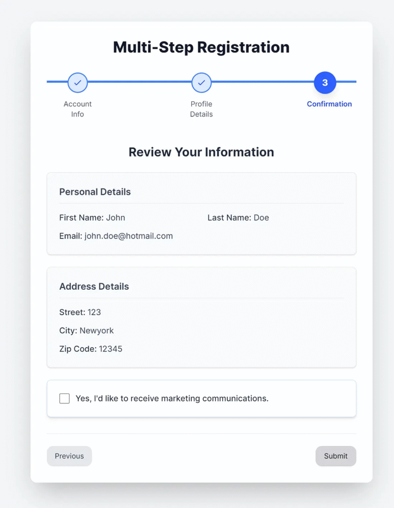
case 2:
return (
<div>
<h3 className="text-2xl font-bold text-gray-800 mb-6 text-center">
Review Your Information
</h3>
{/* Personal Details Card */}
<div className="bg-gray-50 p-6 rounded-lg shadow-sm mb-6 border border-gray-200">
<h4 className="text-lg font-semibold text-gray-700 mb-4 border-b pb-2 border-gray-200">
Personal Details
</h4>
<div className="grid grid-cols-1 md:grid-cols-2 gap-y-3 gap-x-6 text-gray-700">
<p>
<span className="font-medium text-gray-800">First Name:</span>{" "}
{formData.firstName}
</p>
<p>
<span className="font-medium text-gray-800">Last Name:</span>{" "}
{formData.lastName}
</p>
<p className="md:col-span-2">
<span className="font-medium text-gray-800">Email:</span>{" "}
{formData.email}
</p>
</div>
</div>
{/* Address Details Card */}
<div className="bg-gray-50 p-6 rounded-lg shadow-sm mb-6 border border-gray-200">
<h4 className="text-lg font-semibold text-gray-700 mb-4 border-b pb-2 border-gray-200">
Address Details
</h4>
<div className="space-y-3 text-gray-700">
<p>
<span className="font-medium text-gray-800">Street:</span>{" "}
{formData.addressLine1}
</p>
<p>
<span className="font-medium text-gray-800">City:</span>{" "}
{formData.city}
</p>
<p>
<span className="font-medium text-gray-800">Zip Code:</span>{" "}
{formData.zipCode}
</p>
</div>
</div>
{/* Marketing Opt-in Section */}
<div className="bg-white p-6 rounded-lg border border-blue-200 shadow-md">
<div className="flex items-center">
<input
type="checkbox"
id="marketingOptIn"
name="marketingOptIn"
checked={formData.marketingOptIn}
onChange={
(e) =>
handleInputChange("marketingOptIn", e.target.checked)
}
className="h-5 w-5 text-blue-600 focus:ring-blue-500 border-gray-300 rounded cursor-pointer"
/>
<label
htmlFor="marketingOptIn"
className="ml-3 block text-base font-medium text-gray-800 cursor-pointer"
>
Yes, I'd like to receive marketing communications.
</label>
</div>
</div>
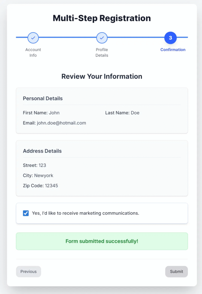
{/* Submission Message */}
{submissionMessage && (
<div
className={`mt-8 p-4 rounded-lg text-center font-semibold text-lg
${submissionMessage.includes("successfully") ? "bg-green-100 text-green-700 border border-green-300" : "bg-red-100 text-red-700 border border-red-300"}
`}
>
{submissionMessage}
</div>
)}
</div>
);
default:
return null;
}
};//components/Stepper.tsx
import React from 'react';
// --- Type Definitions ---
export interface Step {
title: string;
}
interface StepperProps {
steps: Step[];
currentStep: number;
}
// --- Stepper Component ---
export const Stepper: React.FC<StepperProps> = ({ steps, currentStep }) => {
return (
<div className="flex justify-between items-start w-full relative mb-12">
{/* Horizontal progress line */}
<div className="absolute top-4 left-0 right-0 h-1 bg-gray-200 z-0 mx-6 md:mx-10" />
<div
className="absolute top-4 left-0 h-1 bg-blue-500 z-10 transition-all duration-500 ease-in-out"
style={{ width: `${(currentStep / (steps.length - 1)) * 100}%` }}
/>
{steps.map((step, index) => (
<React.Fragment key={index}>
<div className="flex flex-col items-center flex-1 z-20">
<div
className={`
w-10 h-10 rounded-full flex items-center justify-center text-base font-bold
transition-all duration-300 ease-in-out transform
${
index === currentStep
? "bg-blue-600 text-white shadow-lg scale-110" // Current step: prominent
: index < currentStep
? "bg-blue-100 text-blue-600 border-2 border-blue-500" // Completed step: blue outline, lighter fill
: "bg-gray-100 text-gray-500 border-2 border-gray-300" // Future step: subtle gray outline
}
`}
aria-current={index === currentStep ? "step" : undefined}
>
{index < currentStep ? (
// Checkmark for completed steps
<svg
className="w-5 h-5 text-blue-600"
fill="none"
stroke="currentColor"
viewBox="0 0 24 24"
xmlns="http://www.w3.org/2000/svg"
>
<path
strokeLinecap="round"
strokeLinejoin="round"
strokeWidth="2"
d="M5 13l4 4L19 7"
></path>
</svg>
) : (
// Step number for current and future steps
index + 1
)}
</div>
<span
className={`
mt-3 text-sm text-center px-1 max-w-[80px] // Added max-width to prevent overflow
transition-colors duration-300 ease-in-out
${index === currentStep ? "text-blue-700 font-semibold" : "text-gray-600"}
`}
>
{step.title}
</span>
</div>
{/* Add a connector line between steps if it's not the last step */}
{index < steps.length - 1 && (
<div className="flex-1 hidden md:block">
{/* This div helps with spacing but the actual line is absolute positioned */}
</div>
)}
</React.Fragment>
))}
</div>
);
};//components/ValidationRules.ts
import { ValidationRule } from "@/types/ValidationRule";
import { FormData } from '@/types/FormData';
export const ValidationRules: Record<keyof FormData, ValidationRule> = {
firstName: {
required: true,
minLength: 2,
message: "First name must be at least 2 characters",
label: "First name"
},
lastName: {
required: true,
minLength: 2,
message: "Last name must be at least 2 characters",
label: "Last name"
},
email: {
required: true,
pattern: /\S+@\S+\.\S+/,
message: "Please enter a valid email",
label: "Email"
},
addressLine1: {
required: true,
minLength: 2,
message: "Address must be at least 2 characters",
label: "Address"
},
city: {
required: true,
minLength: 2,
message: "City must be at least 2 characters",
label: "City"
},
zipCode: {
required: true,
minLength: 5,
pattern: /^\d{5}(?:[-\s]\d{4})?$/,
message: "Please enter a valid Zip code",
label: "Zip code"
},
marketingOptIn: {
required: true,
message: "",
label: "Marketing communications"
},
};Create types
//types/FormData.ts
export interface FormData {
  // Step 1
  firstName: string;
  lastName: string;
  email: string;
  // Step 2
  addressLine1: string;
  city: string;
  zipCode: string;
  // Step 3
  marketingOptIn: boolean;
}
//types/RenderStepContentProps.ts
import { FormData } from '@/types/FormData';
export interface RenderStepContentProps {
currentStep: number;
formData: FormData;
handleInputChange: (field: keyof FormData, value: string|boolean) => void;
errors: { [key: string]: string | null };
submissionMessage: string;
}//types/ValidationRule.ts
export interface ValidationRule {
required?: boolean;
minLength?: number;
pattern?: RegExp;
custom?: (value: string) => boolean;
message: string;
label: string;
}
export interface StepValidation {
[key: number]: boolean;
}Adding Transitions for a Smoother UX
Transitions help users stay oriented during step changes. You can enhance user flow using CSS or a simple transition library, such as Framer Motion.
Here’s an example with Framer Motion:
npm install framer-motion
Wrap your form content in a motion.div with an animation.
import { motion } from 'framer-motion';


<motion.div
  key={currentStep}
  initial={{ opacity: 0, x: 30 }}
  animate={{ opacity: 1, x: 0 }}
  exit={{ opacity: 0, x: -30 }}
  transition={{ duration: 0.4 }}
>
  <RenderStepContent
    currentStep={currentStep}
    formData={formData}
    handleInputChange={handleInputChange}
    errors={errors}
    submissionMessage={submissionMessage}
  />
</motion.div>
This adds polish to your form wizard. Users experience a natural and smooth transition from one step to the next.
Handling Form Validation
Form validation is critical, especially for onboarding or checkout forms. You can integrate validation with libraries like react-hook-form or write simple inline checks.
Here’s a basic example:
const handleSubmit = async (e: any): Promise<void> => {
  e.preventDefault();
  let allValid = true;
  for (let i = 0; i < steps.length; i++) {
    if (!validateStep(i)) {
      allValid = false;
    }
  }

  if (allValid) {
    setSubmissionMessage("Form submitted successfully!");
  } else {
    setSubmissionMessage("Please complete all steps correctly");
  }
};
For larger projects, integrate schema-based validation with tools like yup or zod.
Test an application
1. Access the wizard page.
http://localhost:3000/wizard

2. Click the “Next” button.

The application validates the input required fields.
3. Input data into the form.


4. Input the data into the form.

5. Submit form.
Conclusion
You’ve seen how to structure steps, handle transitions, validate inputs, and make it mobile-friendly — all with clean and readable code. By following these steps, you can confidently build user flows that convert and engage.
Building a Multi-Step Form
A visual guide to creating intuitive form wizards.
What is a Multi-Step Form?
A design pattern that breaks down a complex or long form into a series of smaller, more manageable steps. This helps to reduce cognitive overload for the user.
Why Use One?
Improved UX
Makes the form less daunting, leading to higher completion rates.
Reduced Friction
Each step requires minimal effort, encouraging users to continue.
Better Data Collection
Enables logical grouping of related fields for clearer data input.
Core Components
State Management
Holds all form data as users progress through steps.
Progress Indicator
Visually shows the user how far they’ve come and what’s left.
Navigation
“Next” and “Previous” buttons to move between steps.
Validation
Verifies user input at each step to prevent errors.
The Process
User lands on the form and completes the first step.
Clicks “Next,” data is saved to state, and the next step is shown.
Validation runs at each step to ensure data integrity.
On the final step, the user clicks “Submit” to send all data.
This article was originally published on Medium.


This multi-step form is like a high-stakes game of Guess the Right Answer, where the rules change every round. The validation checks are stricter than my grandmas cooking – everything must be perfect, or else! The steppers progress bar is the highlight, showing how far you are from screaming into the void if you make a mistake. And those transitions? Theyre like watching paint dry, but with more motion. All in all, its a UX nightmare wrapped in a beautiful UI – a true test of patience and form-filling prowess!
This multi-step form is so meticulously validated, it probably double-checks if the user is actually human and not just a very determined spider trying to steal their data. The Stepper is like a traffic light for user progress, but instead of green, yellow, and red, it’s current, past, and future. The form’s validation rules are stricter than a cat’s grip on a laser dot – you’d think users were applying for a secret society of alphabet soup enthusiasts. And those transitions? They’re smoother than a buttered slide on a downhill ski. If only life could be this organized – imagine your to-do list having this kind of UX.