If you’re building with Next.js and want to add a smooth, user-friendly real-time search feature, you’re in the right place. In this tutorial, we’ll walk through how to use HeroUI’s Input and Listbox components to create a searchable list of users, products, or articles.
Let’s dive in and enhance that UX together!
Why HeroUI and Next.js Are a Perfect Match
Next.js is known for performance and simplicity. HeroUI, on the other hand, provides elegant, accessible components out of the box. Together, they give you the power to build fast, interactive experiences — without all the boilerplate.
When it comes to search, users expect instant feedback. With HeroUI’s Input, we can capture user input in real time. Using Listbox, we’ll display filtered results dynamically. No page reloads. No delays. Just fast, responsive search.
Step 1: Set Up Your Next.js Project

Step 2: Create a Component for the Searchable List
Let’s organize things well. Create a new component file:
We’ll need three things:
Inputfrom HeroUI for search.Listboxto display the filtered list.- A basic array of items to filter.
Here’s the base structure:
"use client";
import { Input } from '@heroui/react';
import {Listbox, ListboxItem} from "@heroui/react";
import { useState } from 'react';
const items = [
{ id: 1, name: 'Next.js Tutorial' },
{ id: 2, name: 'React UI Design' },
{ id: 3, name: 'Building Components' },
{ id: 4, name: 'HeroUI for Beginners' },
{ id: 5, name: 'JavaScript Essentials' },
];
export const ListboxWrapper = ({children} : any) => (
<div className="w-full max-w-[260px] border-small px-1 py-2 rounded-small border-default-200 dark:border-default-100">
{children}
</div>
);
export default function SearchList() {
const [query, setQuery] = useState('');
const filteredItems = items.filter(item =>
item.name.toLowerCase().includes(query.toLowerCase())
);
return (
<div className="max-w-md mx-auto p-4">
<Input
placeholder="Search tutorials..."
value={query}
onChange={(e) => setQuery(e.target.value)}
className="mb-4"
/>
<ListboxWrapper>
<Listbox aria-label="Dynamic Actions" items={filteredItems} onAction={(key) => alert(key)}>
{(item) => (
<ListboxItem
key={item.id}
color={"default"}
>
{item.name}
</ListboxItem>
)}
</Listbox>
</ListboxWrapper>
</div>
);
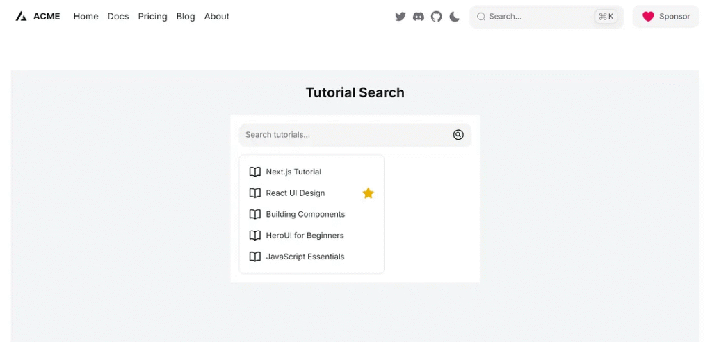
}Simple, clean, and powerful.
Step 3: Add It to Your Page
Let’s use this new component on our main page.
Open /app/search/page.tsx and update it like so:
import Head from 'next/head';
import SearchList from '../../components/search/SearchList';

export default function Home() {
  return (
    <>
      <Head>
        <title>Searchable List with HeroUI</title>
        <meta name="description" content="Learn how to build a searchable list with HeroUI in Next.js" />
      </Head>
      <main className="min-h-screen bg-gray-100 p-6">
        <h1 className="text-2xl font-bold mb-6 text-center">Tutorial Search</h1>
        <SearchList />
      </main>
    </>
  );
}
Step 4: Polish the UX
User experience matters. Let’s improve our list with a few extras:
- Add icon.
- Add minimal styles for clarity.
- Highlight on hover or selected item.
- Add selection mode.
Update your SearchList.tsx:
"use client";

import { Alert, Input } from "@heroui/react";
import { Listbox, ListboxItem } from "@heroui/react";
import React from "react";
import { useState } from "react";

const items = [
  { id: 1, name: "Next.js Tutorial" },
  { id: 2, name: "React UI Design" },
  { id: 3, name: "Building Components" },
  { id: 4, name: "HeroUI for Beginners" },
  { id: 5, name: "JavaScript Essentials" },
];

export const SearchIcon = (props: any) => {
  return (
    <svg
      xmlns="http://www.w3.org/2000/svg"
      fill="none"
      viewBox="0 0 24 24"
      strokeWidth={1.5}
      stroke="currentColor"
      className="size-6"
    >
      <path
        strokeLinecap="round"
        strokeLinejoin="round"
        d="m15.75 15.75-2.489-2.489m0 0a3.375 3.375 0 1 0-4.773-4.773 3.375 3.375 0 0 0 4.774 4.774ZM21 12a9 9 0 1 1-18 0 9 9 0 0 1 18 0Z"
      />
    </svg>
  );
};

export const BookIcon = (props: any) => {
  return (
    <svg
      xmlns="http://www.w3.org/2000/svg"
      fill="none"
      viewBox="0 0 24 24"
      strokeWidth={1.5}
      stroke="currentColor"
      className="size-6"
    >
      <path
        strokeLinecap="round"
        strokeLinejoin="round"
        d="M12 6.042A8.967 8.967 0 0 0 6 3.75c-1.052 0-2.062.18-3 .512v14.25A8.987 8.987 0 0 1 6 18c2.305 0 4.408.867 6 2.292m0-14.25a8.966 8.966 0 0 1 6-2.292c1.052 0 2.062.18 3 .512v14.25A8.987 8.987 0 0 0 18 18a8.967 8.967 0 0 0-6 2.292m0-14.25v14.25"
      />
    </svg>
  );
};

export const StarIcon = (props: any) => {
  return (
    <svg
      xmlns="http://www.w3.org/2000/svg"
      viewBox="0 0 24 24"
      fill="currentColor"
      className="size-6 text-yellow-500"
    >
      <path
        fillRule="evenodd"
        d="M10.788 3.21c.448-1.077 1.976-1.077 2.424 0l2.082 5.006 5.404.434c1.164.093 1.636 1.545.749 2.305l-4.117 3.527 1.257 5.273c.271 1.136-.964 2.033-1.96 1.425L12 18.354 7.373 21.18c-.996.608-2.231-.29-1.96-1.425l1.257-5.273-4.117-3.527c-.887-.76-.415-2.212.749-2.305l5.404-.434 2.082-5.005Z"
        clipRule="evenodd"
      />
    </svg>
  );
};

export const ListboxWrapper = ({ children }: any) => (
  <div className="w-full max-w-[260px] border-small px-1 py-2 rounded-small border-default-200 dark:border-default-100">
    {children}
  </div>
);

export default function SearchList() {
  const [query, setQuery] = useState("");
  const [values, setValues] = useState("");

  const arrayValues = Array.from(values);

  const filteredItems = items.filter((item) =>
    item.name.toLowerCase().includes(query.toLowerCase())
  );

  return (
    <div className="max-w-md mx-auto p-4 bg-white">
      <Input
        placeholder="Search tutorials..."
        value={query}
        onChange={(e) => setQuery(e.target.value)}
        className="mb-4"
        endContent={
          <SearchIcon className="text-2xl text-default-400 pointer-events-none shrink-0" />
        }
      />
      <ListboxWrapper>
        <Listbox
          aria-label="Dynamic Actions"
          items={filteredItems}
          color="primary"
          variant="solid"
          selectionMode="multiple"
          onSelectionChange={(key) => setValues(key as string)}
          selectedKeys={values}
        >
          {(item) => (
            <ListboxItem
              key={item.id}
              textValue={item.name}
              startContent={
                <BookIcon className="text-2xl text-default-400 pointer-events-none shrink-0" />
              }
              endContent={
                item.id == 2 ? (
                  <StarIcon className="text-2xl text-yellow-500 pointer-events-none shrink-0" />
                ) : (
                  ""
                )
              }
            >
              {item.name}
            </ListboxItem>
          )}
        </Listbox>
      </ListboxWrapper>
      {arrayValues.length !== 0 && ( // Use logical AND (&&)
        <div className="flex items-center justify-center w-full p-4"> {/* Added padding */}
          <div className="flex flex-col w-full max-w-lg"> {/* Added max-width for better layout */}
            <Alert
              color={"primary"}
              title={`Selected ${arrayValues.join(', ')}`} // Join array elements for title
              className="rounded-lg shadow-md" // Added basic Tailwind for the alert
            />
          </div>
        </div>
      )}
    </div>
  );
}
Still easy, but more helpful for your users.
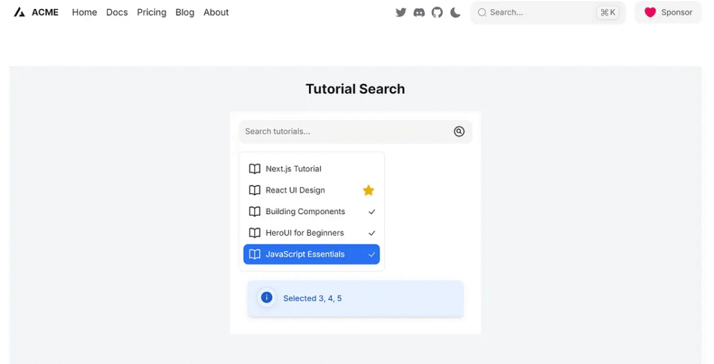
Step 5: Add Custom Data (Users, Articles, Products)
You can easily adapt this to any data type. Here’s an example using users:
const users = [
  { id: 1, name: 'Alice Smith' },
  { id: 2, name: 'Bob Johnson' },
  { id: 3, name: 'Carlos Martinez' },
  { id: 4, name: 'Diana Kwon' },
];
Want to search products? Just replace users with your products array and update the placeholder accordingly.
In each case, use the same logic to filter data by query.
Make It Reusable
Let’s take things a step further. You can turn this into a generic reusable component by passing items as props.
Here’s how:
export default function SearchList({ data, label = 'Search...' }) {
  const [query, setQuery] = useState('');

  const filteredItems = data.filter(item =>
    item.name.toLowerCase().includes(query.toLowerCase())
  );

  return (
    <div className="max-w-md mx-auto p-4">
      <Input
        placeholder="Search tutorials..."
        value={query}
        onChange={(e) => setQuery(e.target.value)}
        className="mb-4"
      />
      <ListboxWrapper>
        <Listbox aria-label="Dynamic Actions" items={filteredItems} onAction={(key) => alert(key)}>
          {(item) => (
            <ListboxItem
              key={item.id}
              color={"default"}
            >
              {item.name}
            </ListboxItem>
          )}
        </Listbox>
      </ListboxWrapper>
    </div>
  );
}
Then use it like this:
//app/search/page.tsx
<SearchList data={users} label="Search users..." />
Now you’re building flexible components that can adapt to any dataset.
Test Application
Run application
npm run dev
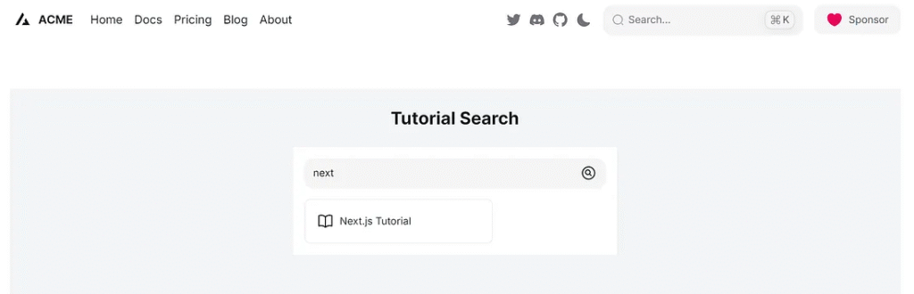
1. Search “next”
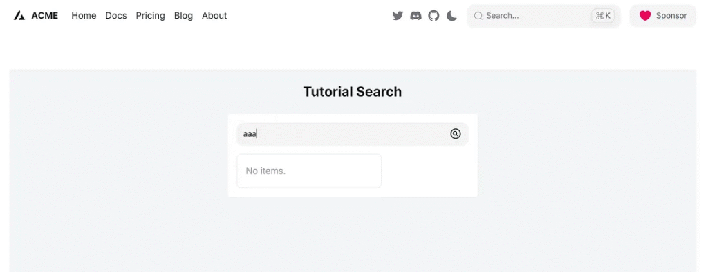
2. Search “aaa”
3. Mouse hover items.
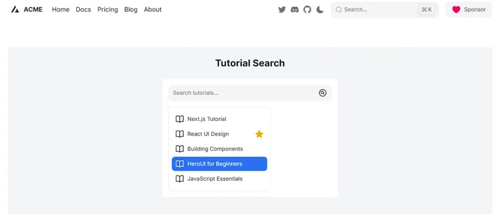
4. Select tutorial.
Finally
You’ve just built a sleek, real-time searchable list using HeroUI and Next.js!
With only a few lines of code, you achieved:
- Real-time UX
- Clean filtering logic
- Component reusability
- Enhanced accessibility and styling with HeroUI
As your project grows, you can plug in APIs, support async search, or paginate results.
Want more tips? I’d love to hear what you’re building next. Let me know if you’d like a follow-up tutorial on server-side filtering or API integration.
Real-Time Searchable List Workflow
A step-by-step visualization of the client-side data filtering process.
1. Input & State Capture
User interaction starts the process.
- HeroUI Component:
Input - Trigger:
onChangeevent - State:
useState(query)updates immediately.
2. Real-Time Data Filtering
The core logic runs on every keystroke.
- Mechanism: Client-Side JS Filter
- Code:
.filter().includes() - Output:
filteredItemsarray.
3. List Rendering
The UI updates instantaneously with the new data.
- HeroUI Component:
Listbox - Binding: Renders only
filteredItems - UX: Zero page reload, fast response time.
4. Component Enhancement
Making the component flexible and user-friendly.
- Reusability: Accept
dataas props. - Features: Add icons, multiple selection mode.
- Next Step: Potential server-side integration.
Technology Highlight: Real-Time Performance
The instantaneous search performance is achieved by leveraging **React Hooks (useState)** within **Next.js** to trigger re-renders and re-run the client-side **JavaScript filter** logic immediately upon input change, paired with the pre-styled **HeroUI components** for rendering.
This article was originally published on Medium.