Today, I’m going to show you how to create one using Next.js and @heroui/react, a modern React component library that includes beautifully designed, customizable UI elements.
We’ll use:
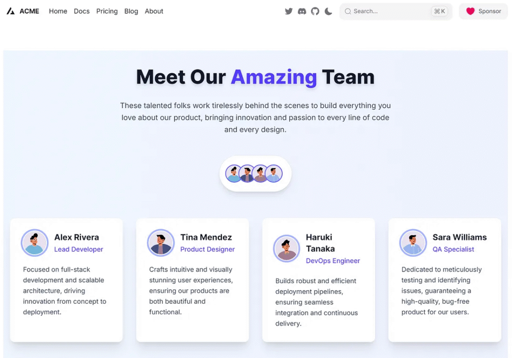
AvatarGroupto display grouped team images.Tooltipfor extra details on hover.Cardcomponents to showcase each team member’s role and contact info.Avatar PlaceholderRandom avatar image.
Let’s get coding!
Setup: Getting Next.js and HeroUI

Creating the Avatar Group Component
We’ll start by building a beautiful avatar group that previews team members.
Here’s what it looks like: a row of avatars with tooltips showing names on hover.
Create a file: components/TeamAvatarGroup.tsx
import { AvatarGroup, Avatar, Tooltip } from "@heroui/react";

const team = [
  { name: "Alex Rivera", img: "https://avatar.iran.liara.run/public" },
  { name: "Tina Mendez", img: "https://avatar.iran.liara.run/public" },
  { name: "Haruki Tanaka", img: "https://avatar.iran.liara.run/public" },
  { name: "Sara Williams", img: "https://avatar.iran.liara.run/public" },
];

export default function TeamAvatarGroup() {
  return (
    <div className="flex justify-center my-12 animate-fade-in-up">
      <div className="bg-white p-4 sm:p-6 rounded-full shadow-lg border border-gray-200">
        <AvatarGroup>
          {team.map((member) => (
            <Tooltip
              key={member.name}
              content={member.name}
              className="bg-gray-800 text-white text-sm px-3 py-1 rounded-md shadow-md"
            >
              <Avatar
                src={member.img}
                alt={member.name}
                size="md"
                className="ring-2 ring-indigo-500 hover:ring-indigo-700 transition-all duration-300 transform hover:scale-110"
              />
            </Tooltip>
          ))}
        </AvatarGroup>
      </div>
    </div>
  );
}
That’s it! This component offers a stylish preview of your team.
The best part? The tooltips feel natural and don’t clutter the layout. Now let’s expand it with team member cards.


Displaying Members with Cards and Tooltips
We would like to provide more details for each individual. Let’s build cards with photos, titles, and descriptions.
Create components/team/TeamCards.tsx:
import { Card, Tooltip, Avatar } from "@heroui/react";

const members = [
  {
    name: "Alex Rivera",
    title: "Lead Developer",
    bio: "Focused on full-stack development and scalable architecture, driving innovation from concept to deployment.",
    img: "https://avatar.iran.liara.run/public",
  },
  {
    name: "Tina Mendez",
    title: "Product Designer",
    bio: "Crafts intuitive and visually stunning user experiences, ensuring our products are both beautiful and functional.",
    img: "https://avatar.iran.liara.run/public",
  },
  {
    name: "Haruki Tanaka",
    title: "DevOps Engineer",
    bio: "Builds robust and efficient deployment pipelines, ensuring seamless integration and continuous delivery.",
    img: "https://avatar.iran.liara.run/public",
  },
  {
    name: "Sara Williams",
    title: "QA Specialist",
    bio: "Dedicated to meticulously testing and identifying issues, guaranteeing a high-quality, bug-free product for our users.",
    img: "https://avatar.iran.liara.run/public",
  },
];

export default function TeamCards() {
  return (
    <div className="grid grid-cols-1 sm:grid-cols-2 lg:grid-cols-4 gap-8 my-16 animate-fade-in">
      {members.map((member) => (
        <Card
          key={member.name}
          className="p-8 bg-white rounded-xl shadow-xl hover:shadow-2xl transition-all duration-300 transform hover:-translate-y-2 border border-gray-100 flex flex-col"
        >
          <div className="flex items-center gap-5 mb-6">
            <Avatar
              src={member.img}
              alt={member.name}
              size="lg"
              className="ring-4 ring-indigo-300 ring-offset-2 ring-offset-white"
            />
            <div>
              <Tooltip
                content={member.title}
                className="bg-purple-600 text-white text-sm px-3 py-1 rounded-full shadow-md"
              >
                <h3 className="text-xl font-bold text-gray-900 mb-1">
                  {member.name}
                </h3>
              </Tooltip>
              <p className="text-md text-indigo-600 font-medium">
                {member.title}
              </p>
            </div>
          </div>
          <p className="text-gray-700 text-base leading-relaxed flex-grow">
            {member.bio}
          </p>
        </Card>
      ))}
    </div>
  );
}
This component adapts nicely to all screen sizes. Each card gives visitors insight into the team, without overwhelming them.
Let’s finish by connecting these components.


Final Integration into the Page
Now, we’ll pull everything together on your main page.
In app/teamgroup/page.tsx:
"use client";

import Head from 'next/head';
import TeamAvatarGroup from '../../components/team/TeamAvatarGroup';
import TeamCards from '../../components/team/TeamCards';

export default function Home() {
  return (
    <>
      <Head>
        <title>Meet the Team</title>
      </Head>
      <main className="container mx-auto px-4 py-10 bg-gradient-to-r from-blue-50 to-indigo-50 min-h-screen">
        <h1 className="text-5xl font-extrabold text-center mb-8 text-gray-900 drop-shadow-lg">
          Meet Our <span className="text-indigo-600">Amazing</span> Team
        </h1>
        <p className="text-center text-lg text-gray-700 max-w-2xl mx-auto mb-12 leading-relaxed">
          These talented folks work tirelessly behind the scenes to build everything you love about our product, bringing innovation and passion to every line of code and every design.
        </p>
        <div className="space-y-16">
          <TeamAvatarGroup />
          <TeamCards />
        </div>
      </main>
    </>
  );
}
Now run your project:
npm run dev
Visit http://localhost:3000 and admire your modern, responsive, and stunning team page!
Create a Random Avatar
The site https://avatar-placeholder.iran.liara.run/ It is a straightforward and convenient tool for generating placeholder avatars. Here’s how to use it:
Basic Usage:
The core of using this service is appending parameters to the base URL to specify the type of avatar you want.
Random Avatar: To get a completely random avatar, you can simply use the base URL:
https://avatar.iran.liara.run/public
Every time you refresh, you’ll get a different random avatar.
Specific ID (to obtain a consistent avatar): If you want to display the same avatar consistently, you can append a number (ID) to the URL.
https://avatar.iran.liara.run/public/1
Finally
You’ve now built a sleek “Meet the Team” layout using Next.js and @heroui/react. Here are a few ways to improve it even more:
- Add social icons using Heroicons.
- Use dynamic data (e.g., pull team data from a CMS or database).
- Add animations for a smoother user experience.
This setup gives a strong first impression and showcases your team’s personality. Keep your UI fresh and inviting.
Next.js Team Page Workflow
Visualizing the tutorial structure using Next.js and HeroUI Components.
1. Setup & Tools
Establish the core environment for development.
- Next.js Framework
- UI Library: @heroui/react
- Styling: Tailwind CSS
2. Avatar Group Component
Create a quick, attractive team preview section.
- HeroUI Component: AvatarGroup
- Interaction: Tooltip for names (on hover)
- Data: Simple list of member names/avatars.
3. Responsive Team Cards
Display detailed information for each team member.
- HeroUI Component: Card
- Layout: Responsive Grid (1, 2, or 4 columns).
- Content: Avatar, Title, Bio.
4. Final Integration
Assembling the components for the live page.
- Main Page: page.tsx
- Layout: Container with centering.
- Aesthetics: Gradient background & bold title.
Key Tech Stack
The design leverages the @heroui/react library for styled components (Card, Avatar, Tooltip, AvatarGroup), which are seamlessly integrated within a Next.js application structure and styled using Tailwind CSS classes for responsiveness and visual polish.
This article was originally published on Medium.