Responsive design defines modern web development. As applications evolve, developers seek efficient layout systems. PrimeFlex, built by PrimeTek, complements Angular perfectly. It offers a utility-first CSS framework that simplifies flexbox and grid layouts. This guide walks you through using PrimeFlex in Angular 20 to build flexible and responsive interfaces step-by-step.
1. Introduction to PrimeFlex in Angular 20
Before diving into code, let’s understand PrimeFlex’s value. It extends CSS utilities for layout, spacing, alignment, and responsiveness. Unlike full UI frameworks, PrimeFlex focuses only on layout logic. It integrates seamlessly with Angular 20’s modern architecture.
Why Use PrimeFlex?
PrimeFlex reduces boilerplate CSS. It enables developers to create adaptive designs more quickly. You can structure a complex page layout with simple classes. This means less custom CSS and more maintainable code.
Advantages include:
- Lightweight and modular CSS classes.
- Fully responsive grid and flex systems.
- Works smoothly with Angular components.
- Ideal for professional and enterprise projects.
2. Setting Up Angular 20 with PrimeFlex
Let’s start with project setup. Ensure your environment runs Node.js 18+ and Angular CLI 20.
Step 1: Create a New Angular Project
ng new primeflex-tutorial
cd primeflex-tutorial
When prompted, choose ‘routing’ if needed, and select either CSS or SCSS for styling.
Step 2: Install PrimeFlex
Install the PrimeFlex package via npm:
npm install primeflex --save
Step 3: Import PrimeFlex into Your Styles
Import it in styles.css (or styles.scss)
@import 'primeflex/primeflex.css';
or for SCSS:
@import "~primeflex/primeflex.css";
Now, PrimeFlex classes are globally available across all Angular components.
Step 4: Verify Installation
To verify, add a quick test class in app.component.html:
<div class="flex align-items-center justify-content-center h-20rem bg-primary text-white">
  PrimeFlex is working!
</div>
Run your project:
ng serve
You should see a centered message with a blue background. PrimeFlex is now active.
3. Understanding the Flex System
PrimeFlex’s foundation is Flexbox. It provides classes that simplify layout alignment and distribution.
Core Flex Classes
flex: Defines a flex container.flex-row/flex-column: Sets direction.align-items-*: Aligns items vertically.justify-content-*: Aligns items horizontally.
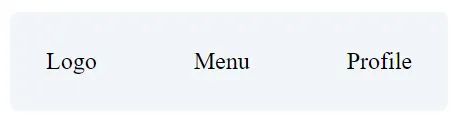
Example: Horizontal Layout
<div class="flex justify-content-between align-items-center p-4 border-round surface-100">
  <div>Logo</div>
  <div>Menu</div>
  <div>Profile</div>
</div>
This layout distributes three sections evenly across a row. This justify-content-between ensures equal spacing.
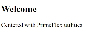
Example: Vertical Centering
<div class="flex flex-column align-items-center justify-content-center h-20rem surface-card border-round">
  <h2>Welcome</h2>
  <p>Centered with PrimeFlex utilities</p>
</div>
With just a few classes, you achieve perfect vertical and horizontal alignment.
4. Creating Responsive Layouts
Modern apps must adapt across devices. PrimeFlex simplifies this with responsive breakpoint utilities.
Breakpoint Overview
BreakpointClass PrefixScreen Widthsmsm:≥ 576pxmdmd:≥ 768pxlglg:≥ 992pxxlxl:≥ 1200px
You can apply breakpoint prefixes to dynamically modify classes.
Responsive Example
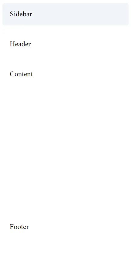
<div class="flex flex-column md:flex-row gap-3">
  <div class="flex-1 surface-100 p-3 border-round">Sidebar</div>
  <div class="flex-3 surface-card p-3 border-round">Content</div>
</div>
On small screens, elements stack vertically. On screens of medium size and above, they align horizontally.
Responsive Spacing Example
<div class="grid">
  <div class="col-12 md:col-6 lg:col-3 p-2">
    <div class="surface-100 p-3 border-round">Box 1</div>
  </div>
  <div class="col-12 md:col-6 lg:col-3 p-2">
    <div class="surface-100 p-3 border-round">Box 2</div>
  </div>
</div>
PrimeFlex’s Grid System complements the flex system perfectly. It’s based on a 12-column structure.
5. Using the Grid System
PrimeFlex includes a powerful grid utility built for responsive layouts.
Grid Basics
Wrap columns within a grid container and use col classes to define widths.
<div class="grid">
  <div class="col-4">Column 1</div>
  <div class="col-4">Column 2</div>
  <div class="col-4">Column 3</div>
</div>
Each column occupies one-third of the row. Adjust col-* classes to customize distribution.
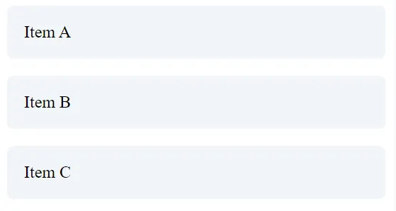
Example: Responsive Grid
<div class="grid">
  <div class="col-12 md:col-4 lg:col-3">
    <div class="surface-100 p-3 border-round">Item A</div>
  </div>
  <div class="col-12 md:col-4 lg:col-3">
    <div class="surface-100 p-3 border-round">Item B</div>
  </div>
  <div class="col-12 md:col-4 lg:col-3">
    <div class="surface-100 p-3 border-round">Item C</div>
  </div>
</div>
This grid shifts between one, two, and four columns depending on the screen size.

6. Controlling Spacing and Padding
Consistent spacing enhances readability. PrimeFlex offers spacing utilities for margin (m-) and padding (p-).
Margin and Padding Syntax
m-1tom-6: Margin levels.p-1top-6: Padding levels.- Directional modifiers:
t(top),b(bottom),l(left),r(right),x(horizontal),y(vertical).
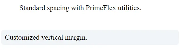
Examples
<div class="p-4 m-3 surface-card border-round">
  Standard spacing with PrimeFlex utilities.
</div>

<div class="p-2 mb-4 mt-1 surface-100 border-round">
  Customized vertical margin.
</div>
Responsive Spacing
<div class="p-2 md:p-4 lg:p-6">
  Adaptive padding for different devices.
</div>
Using responsive modifiers ensures your layout breathes correctly across devices.
7. Alignment and Distribution Utilities
PrimeFlex offers alignment classes to simplify complex arrangements.
Horizontal Alignment
justify-content-startjustify-content-centerjustify-content-endjustify-content-aroundjustify-content-between
Vertical Alignment
align-items-startalign-items-centeralign-items-end
Example: Navigation Bar
<nav class="flex justify-content-between align-items-center p-3 surface-200 border-round">
  <div class="text-lg font-bold">Brand</div>
  <div class="flex gap-3">
    <a href="#">Home</a>
    <a href="#">Docs</a>
    <a href="#">About</a>
  </div>
</nav>
You achieve alignment and spacing without writing a single line of CSS.
Press enter or click to view image in full size

8. Advanced Layout Patterns
Now, let’s create real-world layout structures.
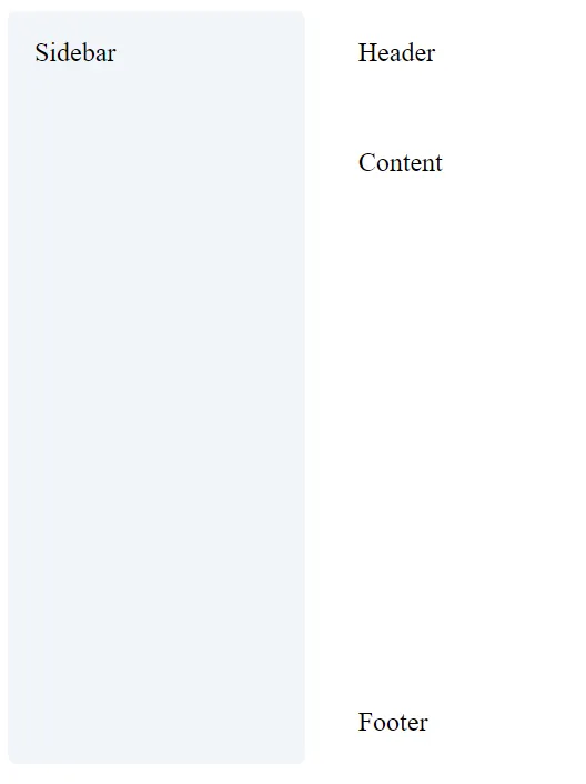
Example: Responsive Dashboard
<div class="grid">
  <div class="col-12 md:col-3">
    <div class="surface-100 p-3 border-round h-full">Sidebar</div>
  </div>
  <div class="col-12 md:col-9">
    <div class="flex flex-column gap-3">
      <div class="surface-card p-3 border-round">Header</div>
      <div class="surface-card p-3 border-round h-20rem">Content</div>
      <div class="surface-card p-3 border-round">Footer</div>
    </div>
  </div>
</div>
This example stacks vertically on mobile and adapts to a two-column layout on larger screens.
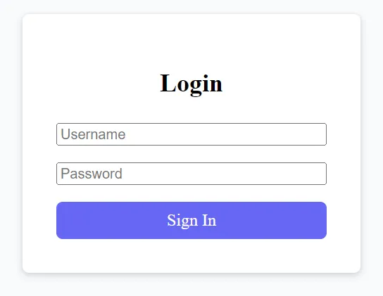
Example: Centered Login Form
<div class="flex align-items-center justify-content-center min-h-screen surface-50">
  <form class="surface-card p-5 border-round shadow-2 w-20rem">
    <h2 class="text-center mb-4">Login</h2>
    <input type="text" placeholder="Username" class="p-inputtext w-full mb-3" />
    <input type="password" placeholder="Password" class="p-inputtext w-full mb-3" />
    <button class="p-button w-full">Sign In</button>
  </form>
</div>
With minimal classes, you achieve a clean, responsive login view.
9. Responsive Design Tips with PrimeFlex
- Use a mobile-first design approach: Define default styles for small devices, then scale them up.
- Apply consistent spacing by using PrimeFlex padding and margin classes.
- Leverage the grid system: It simplifies alignment and responsiveness.
- Avoid inline styles: Keep layout logic within PrimeFlex classes.
- Combine utilities carefully: Too many overlapping classes can create conflicts.
Example: Adaptive Cards Section
<div class="grid">
  <div class="col-12 md:col-6 lg:col-4">
    <div class="surface-card p-4 border-round shadow-2 h-full">
      <h3>Performance</h3>
      <p>PrimeFlex ensures consistent spacing and responsiveness.</p>
    </div>
  </div>
  <div class="col-12 md:col-6 lg:col-4">
    <div class="surface-card p-4 border-round shadow-2 h-full">
      <h3>Flexibility</h3>
      <p>Its modular approach integrates with existing Angular components.</p>
    </div>
  </div>
</div>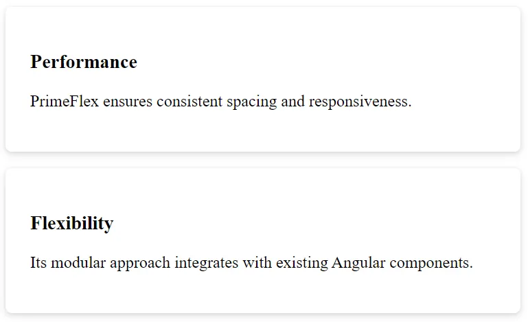
10. Theming and Customization
PrimeFlex includes utilities for color, background, and border radius. Combine them for visual appeal.
Example: Themed Cards
<div class="grid">
  <div class="col-12 md:col-4">
    <div class="p-4 border-round surface-100 text-center">
      <h4 class="text-primary">Primary Theme</h4>
    </div>
  </div>
  <div class="col-12 md:col-4">
    <div class="p-4 border-round surface-200 text-center">
      <h4 class="text-secondary">Secondary Theme</h4>
    </div>
  </div>
</div>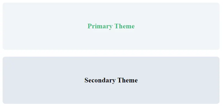
Adding Custom Styles
You can still extend styles in styles.css:
.custom-card {
background-color: #f0f9ff;
border-radius: 12px;
box-shadow: 0 2px 8px rgba(0,0,0,0.1);
}
.text-brand {
color: #2563eb; /* blue-600 */
}
.bg-brand {
background-color: #3b82f6; /* blue-500 */
}
.hover\:bg-brand:hover {
background-color: #2563eb; /* darker on hover */
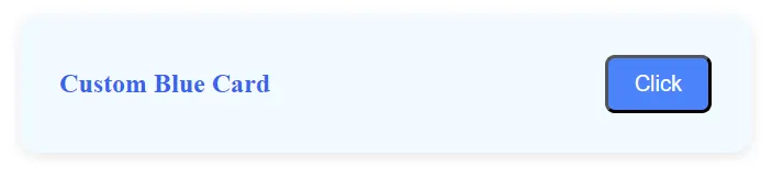
}Combine your CSS with PrimeFlex classes for fine control.
<div class="custom-card p-4 m-3 flex align-items-center justify-content-between">
  <span class="text-brand font-bold">Custom Blue Card</span>
  <button class="bg-brand hover:bg-brand text-white px-3 py-2 border-round">Click</button>
</div>
11. Performance and Accessibility
PrimeFlex promotes cleaner, modular CSS. This reduces CSS payloads and improves page performance. Angular 20’s differential loading and lazy modules enhance this further.
Accessibility Considerations
- Ensure sufficient color contrast.
- Use semantic HTML elements.
- Test with screen readers.
PrimeFlex handles structure; accessibility remains your responsibility.
12. Best Practices and Common Pitfalls
Best Practices
- Keep layout logic in HTML, not component styles.
- Use consistent naming for custom CSS.
- Leverage
flexandgridinstead of manual media queries.
Avoid
- Mixing grid and flex in the same container unnecessarily.
- Overriding PrimeFlex classes frequently.
- Ignoring responsive prefixes.
Finally
PrimeFlex enhances Angular 20 development by simplifying responsive layouts. It offers intuitive class utilities for alignment, spacing, and distribution. You save development time, reduce CSS clutter, and maintain consistency across your projects.
By mastering these utilities, you build scalable interfaces with less effort. Use PrimeFlex with Angular’s component-driven structure, and you’ll create elegant, mobile-first web experiences effortlessly.
Keep practicing these utilities to refine your design fluency. PrimeFlex turns complex responsive behavior into clean, readable markup — empowering every Angular developer to craft professional, adaptive UIs.
This article was originally published on Medium.